Supplies Needed:
My zip includes 2 textures and star shape, all of which you can download HERE
1. Start by opening a new transparent image about 400 x 400.
2. Open up one of the textures from the zip. I'm going to be using the brown one for this tut.
3. Set your foreground and background pattern to the texture you've chosen. Angle 0 and Scale 100.
4. Click on your preset shapes tool on the left and set it to the rounded star that was included in the zip. Anti-alias and Create as Vector are both checked, Line Style is solid, Width is 1.
5. Hold down your Shift key to keep the star proportioned and drag out your shape onto your canvas. You'll notice on the right side that it's a little darker. That's because this swatch isn't seamless. I would have made it seamless, but I didn't like the end result, but don't worry, we will fix that up a bit later on.
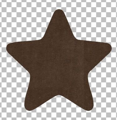
6. In the layer palette on the right, right click on Vector 1 and from the flyout choose Duplicate.
* You should now have Copy of Vector 1 in the top position in the layer palette.
7. Click on your Eyedropper from the toolbar on the left, then click once somewhere on your brown star to set that colour as your foreground colour. Then Right Click somewhere on your brown star to set it as your background colour. We will be switching from our pattern to use a colour in a minute.
8. In the layer palette on the right, click once on your original star shape, it should be still named Vector 1. Click the small + sign in front of it.
9. Double click on the name of the shape that appears under Vector 1 (in our case Star) and your properties box will pop up.
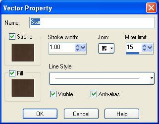
10. Click once on the brown swatch under the word Stroke and your material palette will pop up.
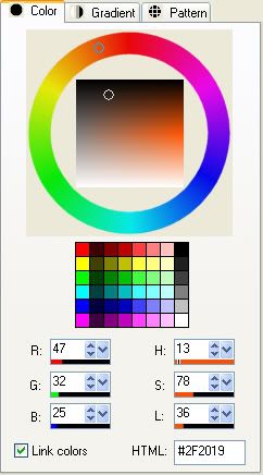
11. Click on the Colour tab at the top and your brown colour you chose from your star with the eyedropper tool should be there. We need to make it a few shades darker so with your mouse, click once a little bit above the circle that you see in the colour palette. My colour turned out to be #2F2019. Click OK when done.
12. Back in your Vector Properties box now, change the Stroke to 7.
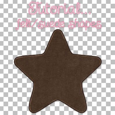
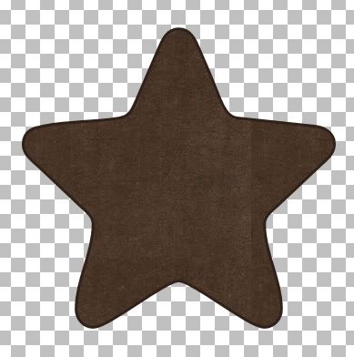
13. Click on the brown swatch under the Fill, and change that colour to the same colour you chose for the Stroke above. Again, mine was #2F2019 and click OK. This is what you should have now:
14. In the layer palette, right click on Vector 1 and from the flyout choose Convert to Raster Layer.
15. Do the same for Copy of Vector 1.
* Now to get rid of that darker right side.
16. In the layer palette on the right, click on Copy of Vector 1 to make it our active layer. Go up to the Selections tab, choose Select All, back up to the Selections tab and choose Float, then back up to the Selectios tab and choose Defloat.
* You should have marching ants all around your star image.
17. On the left, click on your Clone tool. Set the size to about 30 and opacity to 100. Right click once near the middle of your star then move over to the right side and with a few clicks, clone over that dark line a bit.
18. Selections tab again, choose Modify, then choose Contract and type in the number 2 for the Number of Pixels section and hit OK.
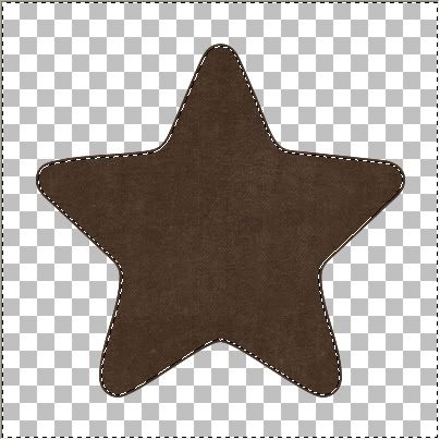
19. Go back to the Selections tab and choose Invert. This is what yours should look like (Ive turned off my darker bottom layer for you too see it better)
20. Turn off your darker bottom layer by clicking the eye icon next to it.
21. Choose your Lighten/Darken tool on the left. Default round brush, Size is 12, Hardness is 50, Step 25, Density and Thickness is 100, Opacity is about 53, and Mode is Lightness.
22. Lighten all around that 2 pixel outline of our star. Try and use long even strokes because if you go over the same spot more than once, it will lighten considerably more than you want it too.
* When you think you've got it, turn your darker star layer back on and see what it looks like. Here's what mine ended up looking like:
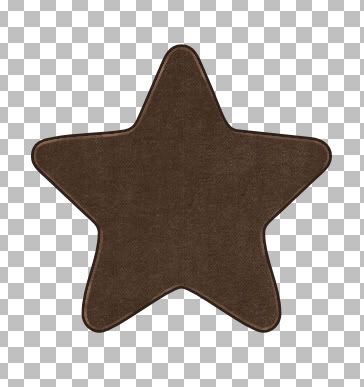
* Because this brown is such a dark colour, this won't make much of a difference on it, but if you are using a lighter colour, try putting a tiny drop shadow under your top layer to give it a bit more definition. All's left to do is merge visable your layers and you're done :)
Go HERE to learn how to put stitches onto your shape.
TOU:
If you do this tutorial, your end result is yours to do whatever you wish; give it away as a freebie, use it as part of a kit, or sell it for profit. You may not make this into an action or script to give away as a freebie or to sell for a profit. A mention or a link back here would be appreciated but is not mandatory. Please do not share the supplies or tut through email or any other means, send them here to my blog to get the supplies and tut for themselves.


Thank you! Your blog post will be advertised on the DigiFree Digital Scrapbooking Freebie search engine today (look for timestamp: 03 Jul [LA 02:19am, NY 04:19am, UK 09:19am, OZ 07:19pm]).