


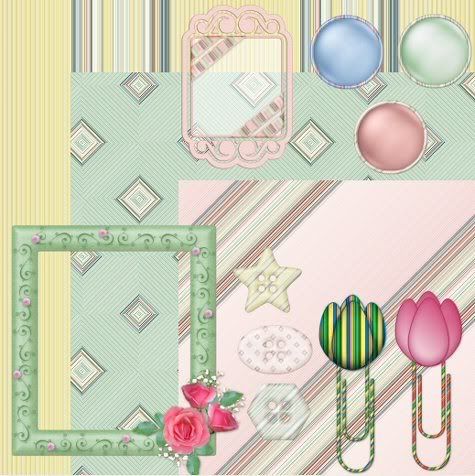
First thing you need to do before anything else is find out what size of canvas width your blog or site will allow, without it overlapping into the sides of your blog. My width limit is 550 pixels, but my length can be anything I choose. I'm going to be using my Spring Kit for this tut.
Normally, I use all my papers as my background for the preview, so open up all of your papers in PSP and duplicate each one (hold down your Shift key on your keyboard and hit the D key to duplicate) then close out the originals. We are going to be cutting these so we don't want to wreck the one's you are going to be giving away.
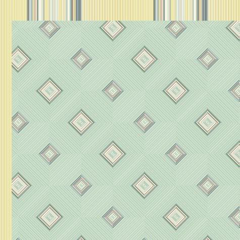
1. Select one of your duplicated background papers to start working with. Click on your Crop tool on the left.
2. Up at the top, you will see Width and Height.
 . Type in the amount of pixels that your preview canvas is. Mine was 550 x 550.
3. Place your cursor on your paper somewhere inside your crop box and then move the crop box to a section of your paper that you want displayed as part of your preview background. When you've got that set as you like it, just double click inside the crop box. This will be your main canvas you will be working on.
This is the cropped version of my first background paper that I chose:

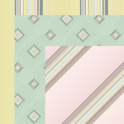
4. Choose another background paper and crop it to the same Width and Height as you did with the first paper.
* Now we are going to either drag and drop or copy and paste this second paper onto your first paper that is on your main canvas.
5. Make sure your second paper is the active one, and go up to the Edit tab, then to Copy. Click on your main canvas ( which is what your first cropped paper is on) to make it the active one. Then go back up to the Edit tab and over to Paste, then to Paste as New Layer.
* Your second paper will be covering your first, so we need to move that down.
6. Click on your Mover tool on the left and shift your second paper down a little bit so that you can see both of them. Here's what mine looks like at this point:
* All drop shadows will be left untill the end so don't put any on just yet.
* I actually have 10 papers in this preview, but becase it's very early in the morning and I'm lazy, I'm only going to be doing 3.
7. Repeat theses steps for as many papers as you have in your kit. Use your mover tool to shift each one downwards and make them evenly spaced with each other. Here's mine with 3 papers:
* Now that we've got our papers displayed as we want them, it's time for the elements. I always tube my elements when doing preveiws. I do this because it is much easier to resize them down this way than just duplicating them, then resizing. Also, I find that they come out nicer without the distortion and sometimes jagged looking edges.
8. Start by opening up some of the elements you want to use in the preview. If you have a ton of them in your kit, you may not be able to display them all, so open up the ones you like the best. I'm going to use a few of the paperclips I had made for this kit.
9. I always name my preview tubes starting with the word Temporary so that I can find them easily when I am done my preview and delete them so it doesn't clog up my tube section. So for example, I have my first paperclip ready to tube. Duplicate it and close out the original. Crop out all the unneccissary space around your first element, and make sure it doesn't have more than 1 layer.
10. Go up to the File tab, down to Export, then over to Picture Tube. Give your tube a name such as temporary spring 01 ( or whatever your kit is called) and then click the OK button.
11. Do this for each of the elements you are going to be using for your preview. It doesn't matter if it is a really big element either, such as a frame, it can still be tubed.
12. When you've finished your tubing, on your background main canvas, create a new layer. (Layers tab at the top, choose New Raster Layer).
13. The placement of your elements is all up to you, but you need to get the sizing of them appropriately for your preview. What I do is, make a duplicate of your main background canvas to use as a test run. Click on your Tube tool and choose your first element.
14. Plop it down on your test run canvas to see how big it is. More than likely it will be too big for your preview, but it gives you an idea of how much you need to scale it down. Go up to the Edit tab and click undo to get rid of it, then scale it down a bit and plop it back onto your test run canvas. ( to scale down, look up top for the section labled Scale and under it will be 100. Use the down arrow next to it to scale it down to a lower number. This will decrease your tube's size) Do this untill you find a size that looks good. Then go back to your main canvas and put your tube down there. Remember to always put each tube on a new layer so that you are able to move it around and to apply your drop shadow to a single item.
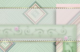
* Tip: Don't make everything the same size, vary it up. Here's mine. I've added a few elements and have not yet put a drop shadow on anything.
15. When you have it all placed and it looks good, then you can click on each item seperately and put on a drop shadow of your choice. I can't tell you what that is because your shadow will depend on your own elements. If it is a light colour, you will not be using the same very dark shade of a shadow that you would on a dark coloured element. So that part is all up to you.
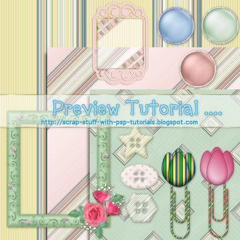
* When your shadows are finished, you need to put your blog address and title on your preview kit. This is up to your own imagination and likes and preferences. Most times, I just use a simple partially opaque ribbon going across the preview pic, and I add my blog address and the name of my kit.
16. I've set my forground to a gold pattern, turned off my background so that I will just be getting an outline of a rectangle and not a filled one. Line style is solid, and a width of 1. Draw out your rectangle straight across your preview canvas. Right click and convert to raster layer.
17. Click on your Magic Wand tool, and click once inside your rectangle that's on your canvas. You should have marching ants all around inside the rectangle.
18. Go up to the Selections tab, down to Modify then over to Expand. Expand by 1 pixel.
19. Go up to the Layers palette and make a new raster layer and drag it under your rectangle you just drew.
20. Click on your Flood Fill tool on the left and fill your blank layer with white, then lower the opacity to about 45.
* The lowered opacity of the white lets you have the appearance of a label ribbon, but still lets you see what is beneath it.
21. Go up to the Selections tab at the top and choose Select None. Here's where I'm at right now.

22. In the layers palette, turn off all of your layers except the outline of the gold rectangle and the lowered opacity white layer. Then right click on one of those still visable layers and choose Merge, then Merge Visable.
* You can now move this down to the middle of your preview canvas.
* You need to put a slight drop shadow on your ribbon label and with white opaque items, that's a bit tricky. This is my way of doing it.
23. Make your label ribbon acitve by clicking on it on your canvas or in the layer palette. Go up to the Effects tab, then to 3D Effects, then over to Drop Shadow. Use these settings:
Vertical: 1
Horozontal: 1
Opacity: 32
Blur: 7
Colour: #221D12
Shadow on a New Layer is CHECKED. << Very important that it is on it's own layer.
* You'll notice that your white had turned darker because of the shadow we just put on it. We are going to get rid of most of it with our rectangle tool.
24. Click on your Selection tool and set it to rectangle. We want to get our rectangle as close to the top and bottom gold outlines as possible. Try not to go outside of the gold oulines because then you will be deleting part of your shadow. You may want to zoom in closer for this step. See my example below:
25. Once you are satisfied with your results, make sure you have the shadow layer of your label ribbon as your active layer in the layer palette. Hit the delete key on your keyboard. By doing so, you have just deleted all the shadow from inside your white label but still have the shadow showing only on the outsides of your label.
26. Choose a nice font and colour for your text. Normally, I choose a darker shade for the foreground and a lighter shade of the same colour for the background. In this case, I'm going to use #2E9ED2 for my foreground outline, and #A6D9F0 for my background fill of my text.
27. Type out the name of your kit, your blog name/address and any other information you want on there.
28. All that's left to do is to save it as a .jpg and you're ready to upload it to photobucket or some other photo hosting site.


Thank you for this tutorial. I really needed this one!
Cathy