Sunday, July 22, 2007
Ribbons and Matching Curls Part 1
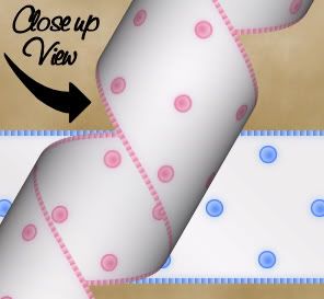
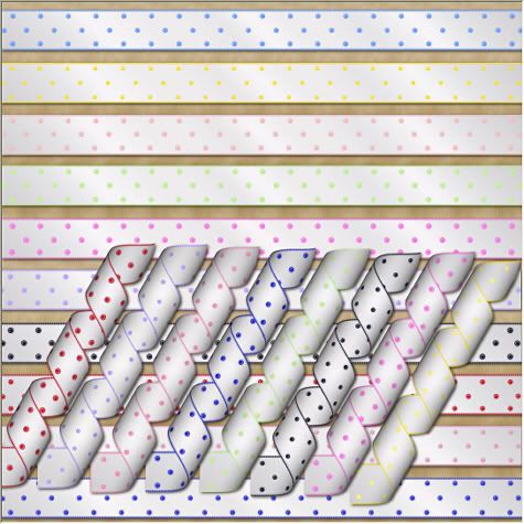
This is what we are going to be making. Part 1 shows you how to make the straight ribbon, and Part 2 shows you how to get the finished ribbon to form a curl.

Photo Sharing and Video Hosting at Photobucket


Photo Sharing and Video Hosting at Photobucket


I'm assuming you already have your copy of Paint Shop Pro for this tutorial. You also need Mura's Meisters copies plugin, which you can get Here, and Nanson's mqc snow gradient which you can get at her site Here. Place the gradient in your gradients folder, and the mm copies in your plugins folder.


Start by opening a new, transparent image with whatever dimensions you want for your ribbon. Add 10 extra pixels to the width because we are going to crop a little bit off when we are finished. For this tutorial, we are going to be using 1810 x 140. Set your foreground to #F761D9, and fill your transparent layer with this. Go up to the "Effects" tab, and choose "Texture Effects", then choose "Blinds". Put your settings to the following, and click ok.
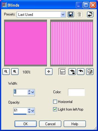

Photo Sharing and Video Hosting at Photobucket


Your solid image should have changed to look like this:
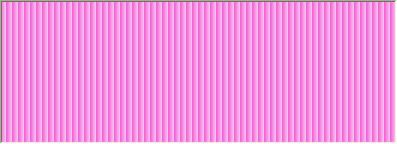

Photo Sharing and Video Hosting at Photobucket


We want just a small corrugated edge surrounding our ribbon, so go up to the "Selections" tab and choose "Select All", "Selections" tab again and choose "Float", "Selections" tab again and choose "Defloat", then back up to the "Selections" tab and choose "Modify", then choose "Contract" and in the number of pixels box choose 5 and hit ok.

Set your foreground to the mqc snow gradient with these settings:
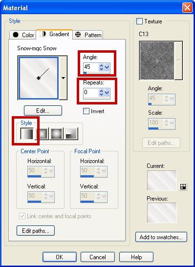

Photo Sharing and Video Hosting at Photobucket


Flood fill your contracted layer with the gradient. Go up to the "Selections" tab and choose "Select None". In your material palette to the right, set your foreground back to our original colour of #F761D9, and your background colour to white. Click on your background again and select the "Gradient" tab and change it to foreground-background, with the following settings:
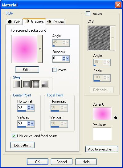

Photo Sharing and Video Hosting at Photobucket


Your materials palette should now look like this:
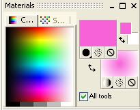

Photo Sharing and Video Hosting at Photobucket


Select your preset shapes tool, and put it at ellipse, Anti-alias checked, Create as vector checked, Line style is solid, and a line width of 1. Hold down your shift key, and draw out a small dot shape on your layer. If satisfied with your dot, In the layer palette, right click on your dot vector layer and choose "Convert to raster layer".

Now, we want this one dot to be perfectly centered on our ribbon, so go up to the "Edit" menu and select "Cut". Then, back up to the "Edit" menu and choose "Paste as new layer". This will center our dot evenly in the middle of our ribbon but on a new layer. Make sure your dot layer is active. Next, go to the "Effects" tab, then to "Plugins" and from the flyout, choose "Mura's Meister" then "Copies". Choose the following settings: (You can play with the spacing of your dot line by increasing or decreasing the digits in the "Number" box.)
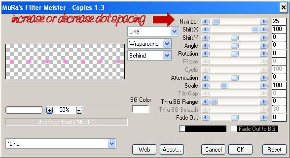

Photo Sharing and Video Hosting at Photobucket


Your image should now have a line of dots from end to end. Select your mover tool and move that line of dots up to the top of the white part of your ribbon. Make sure that line of dots is active, and go to the "Edit" tab, and select "Copy". Go back to the "Edit" tab and select "Paste as new layer" and move that layer down to the bottom of your white ribbon. Make sure the dots are even in line with the top layer. Go back to the "Edit" tab and choose "Paste as new layer" again and move that line to the right and position it so that the dots are staggered between the top and bottom lines.

When satisfied with the placement of your dot lines, in the layer palette to the right, right click on a layer and choose "Merge" then "Merge Visable". I had you add 10 extra pixels to the width of your transparent layer when we first started out because now we are going to crop off the edges for a more realistic look. To finish up, crop a little bit off each of the ends of your image, a bit past the white part like the finished picture below:
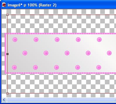


Photo Sharing and Video Hosting at Photobucket


Extra Tip: To give it a little bit of a satin sheen, use the Xero porcelain plugin on the finished ribbon.
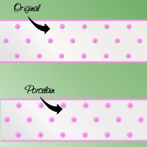

Photo Sharing and Video Hosting at Photobucket

TOU:

If you do this tutorial, your end result is yours to do whatever you wish; give it away as a freebie, use it as part of a kit, or sell it for profit. You may not make this into an action or script to give away as a freebie or to sell for a profit. A mention or a link back here would be appreciated but is not mandatory. Please do not share the supplies or tut through email or any other means, send them here to my blog to get the supplies and tut for themselves.
 
posted by Scrap Stuff by Shawna at 2:53 PM | Permalink | 16 comments
Curled Ribbons
Part 2:


To give your ribbon a spiral curl, you will need AV Bros page curl. There is a free trial version of this, I'm not positive, but I think in the free trial, the words "demo" appear all over your finished image, so you will need to have the paid version of this plugin.

In paint shop, open up a new transparent image, big enough that you have a lot of empty space all around the ribbon we just made. I'm using 1800 x 1800.

Copy and paste your ribbon horozontally onto the new 1800 x 1800 layer.

Go up to the "Effects" tab and then to "Plugins" and choose "AV Bros Page Curl".

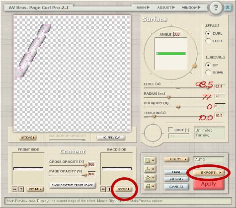
You can fool around with the settings to get different looks, but here is what I have used:

Photo Sharing and Video Hosting at Photobucket


To get your polka dot pattern to appear on the back of the ribbon as well, at the bottom click on the second "Define" button to the right and choose "From Current Layer". Then go to the "Export" tab and choose "Render Result To" and choose either PNG or PSD and save it to wherever you want.
 
posted by Scrap Stuff by Shawna at 2:48 PM | Permalink | 26 comments
Saturday, July 14, 2007
Puffy Shiny Sticker
For this tutorial, I am assuming you already have a copy of Paint Shop Pro. A full 30 day trial of EyeCandy 5 Impact can be downloaded Here
The EC 5 sticker preset can be downloaded Here. Place the bevel into your EC 5 Impact bevel folder.


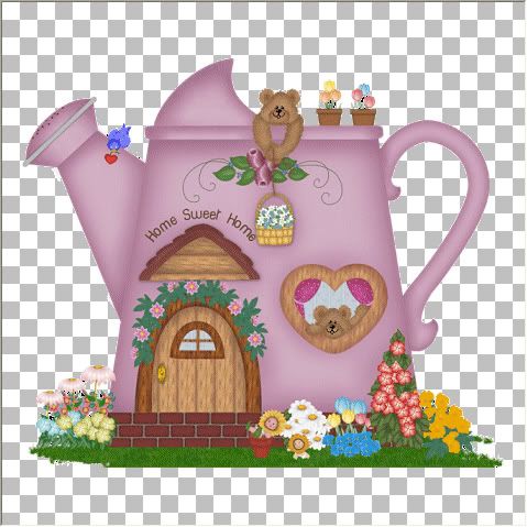
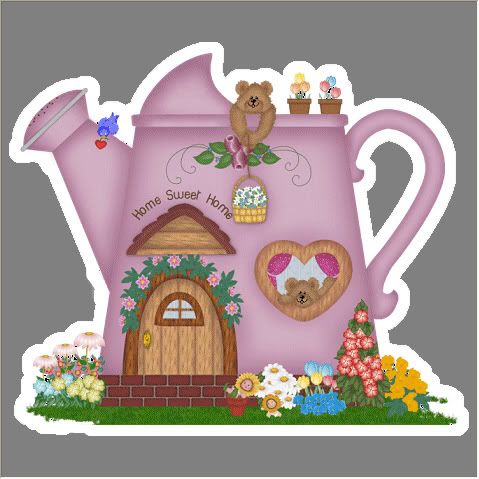
Start by opening up the image you are going to use. If it's an image with a background that you don't want, you need to erase the background like you would if you were going to tube it. See example picture below.


Photo Sharing and Video Hosting at Photobucket


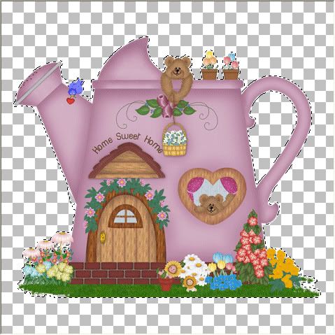
Make sure your canvas is larger than your image with a good amount of blank space all around it. Next, add a new layer and fill it with white or a colour/pattern of your choice. In your layer palette to the right, select your image layer and go up to the "Selections" tab and choose "Select All", then "Float", then "Defloat". Your image should have marching ants around it like in the picture below.


Photo Sharing and Video Hosting at Photobucket


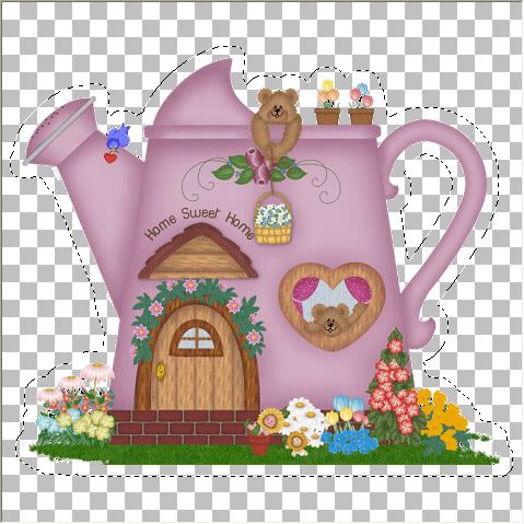
Next, go up to the Selections tab, and choose "Modify", then "Expand". I've chosen to expand by 10 pixels, but your number will depend on how big or small of a sticker border you want. If you've chosen 10 like I have, it will look like the picture below.


Photo Sharing and Video Hosting at Photobucket


Do not deselect. Right click on a layer in your palette and select "Merge Visable". Your layers should all be merged into one and your merged image should still look the same with the marching ants expanded all around it. Go to the "Edit" tab and select "Copy". Open up a new transparent image, and paste your copied image into there. It should now have a 10 pixel white border around it as in the picture below. I've added a grey background so it is easier for you to see the white border.


Photo Sharing and Video Hosting at Photobucket


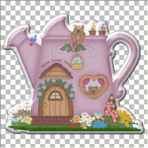
Go to the "Effects" tab, then to "Plugins", then to "EyeCandy 5 impact", then to "Bevel". With the "Settings" tab selected, under the "Factory Settings", select the preset "My Puffy Shiny Sticker Bevel", and click ok and you're done. You can also play around with the lighting to get a lighter or darker shine effect.


Photo Sharing and Video Hosting at Photobucket

TOU:

If you do this tutorial, your end result is yours to do whatever you wish; give it away as a freebie, use it as part of a kit, or sell it for profit. You may not make this into an action or script to give away as a freebie or to sell for a profit. A mention or a link back here would be appreciated but is not mandatory. Please do not share the supplies or tut through email or any other means, send them here to my blog to get the supplies and tut for themselves.
 
posted by Scrap Stuff by Shawna at 7:25 PM | Permalink | 18 comments
Tuesday, July 3, 2007
Changing the Colours of Embelishments
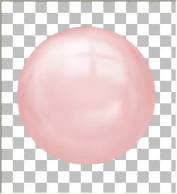
I'm using psp8 for this tutorial, but I'm sure the steps are pretty similar for other versions as well. Included in the zip file is the pink bead in psp format as well as psd format for other versions of psp.


Download Zip Here


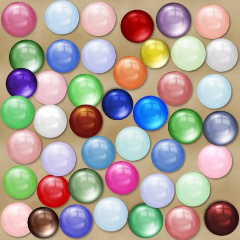
From this one pink bead I had made, I played around with adjusting the colours and the results are all in the picture below.


Photo Sharing and Video Hosting at Photobucket


Photo Sharing and Video Hosting at Photobucket


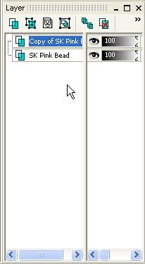
To get a darker version of the pink, in your layer palette to the right, right click on your bead layer and from the flyout choose "duplicate". You will now have a copy of your new bead layer above your original layer.


Photo Sharing and Video Hosting at Photobucket


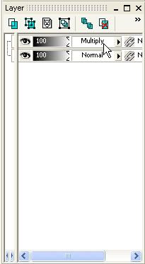
Make sure your "Copy of SK Pink Bead" is highlighted blue, and change the "Blend Mode" to "Multiply". If you can't see where your blend mode is, just move the vertical divider line over to the left.


Photo Sharing and Video Hosting at Photobucket


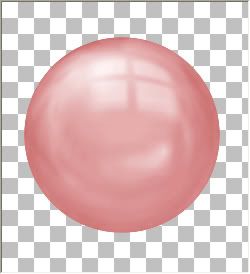
Your bead should be a darker version of the original, and look like the picture below. You can also try setting the blend mode to Screen, Overlay and Soft Light. Depending on the colour of your bead, it gives you different looks.


Photo Sharing and Video Hosting at Photobucket


Now, just right click on one of your layers and from the flyout choose "Merge" then "Merge Visible".
After you merge your layers, you can also repeat the steps above, using different blend modes.


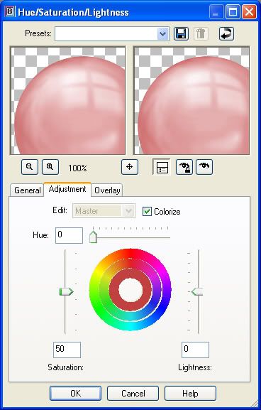
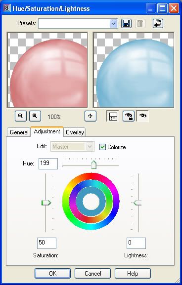
Continuing on working with this same bead we just changed, right click your new bead layer in your palette, and choose "New Adjustment Layer", then from the flyout choose "Hue/Saturation/Lightness". Put a checkmark in the "Colorize Box", and move the saturation slider up to about 50%.


Photo Sharing and Video Hosting at Photobucket


Make sure your bead is visable in the preview window, and move the "Hue" slider bar slightly to the right. You will see your embelishment change from it's original to a new colour. If you'd like to see what it will actually look like on your embelishment layer in your workspace, click the square button with the eye icon that's under your preview window. When you are satisfied with your chosen colour, click ok and merge the two layers.


Photo Sharing and Video Hosting at Photobucket


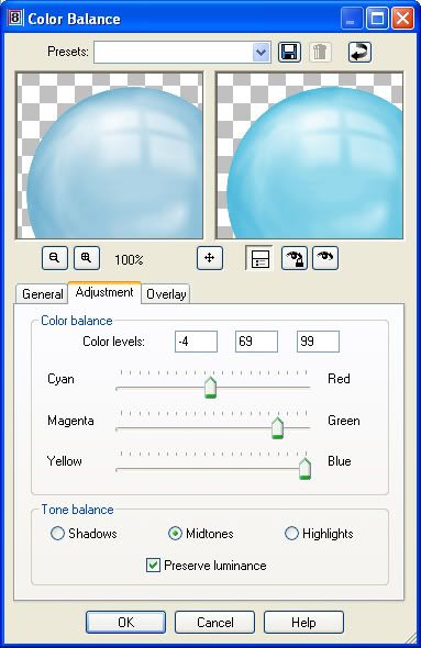
You can also change the shade of your bead by right clicking your bead layer in the layer palette, go up to "New Adjustment Layer" then to "Colour Balance", and just start moving the slider bars till you see something you like.


Photo Sharing and Video Hosting at Photobucket


Head on over to my blog http://scrap-stuff-with-psp.blogspot.com/ to get all of these glassy beads and other fun stuff.
 
posted by Scrap Stuff by Shawna at 12:27 PM | Permalink | 4 comments