Wednesday, November 28, 2007
Winter Ice
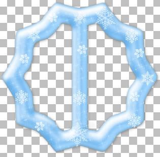
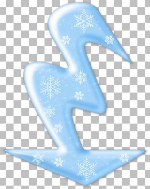
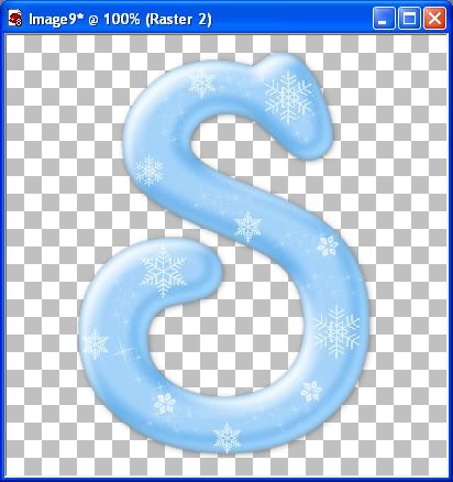
This is what we will be making

Photo Sharing and Video Hosting at Photobucket


Supplies Needed: Paint Shop Pro, EyeCandy5 Impact, My Snowflake Tubes, Font


PSP8 Trial Version: Download Here
EC5 Impact Trial Version: Download Here
Supplies Zip: Download Here


Although, this is written for PSP, I'm sure it can also be done in Photoshop as well. If you are making an alpha, you need to choose a fat font, as skinny ones do not show very well. Keep in mind, that this tutorial is to show you a "technique" and can be done on any shape, not just fonts. See examples at the end of this tutorial. You can download this already made alpha, caps and lowercase on my blog Here


1. Open up a 500 by 500 transparent image. When drawing your text or shape, be sure to leave extra room all around, as we need to move it around the canvas.
2. Set your foreground and background to #69BAFB. Open up your font in PSP, Size 350, Stroke width 1, Anti-alias is checked. Type out your S on your canvas.
3. In the layer palette to the right, right click on Vector 1 and from the flyout choose Convert to Raster Layer, then rename it to S.
4. Go up to the "Selections" tab, choose "Select All", then to the "Selections" tab again, choose "Float", back up to the "Selections" tab and choose "Defloat".
5. Go up to the "Layer" tab and choose "New Raster Layer", then name this layer Light Blue.
6. With the Blue layer active (it should be highlighted blue), Go up to the "Selections" tab, choose "Modify" then choose "Contract". Set the number of pixels to 4 and hit ok.
7. Change your foreground colour to #A1D6FF, and flood fill this layer with the lighter blue. It should look like the picture below

Photo Sharing and Video Hosting at Photobucket

8. Now switch to your mover tool. Place your cursor on the light blue layer, and move it downwards just a bit like in the picture below.
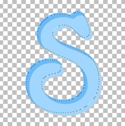
Photo Sharing and Video Hosting at Photobucket

This is a bit confusing to look at, but your marching ants will stay in place, but the light blue that is OUTSIDE of the march ants is going to be our blue highlight.
9. Hit the delete key on your keyboard. Everything that was INSIDE the marching ants should have disappeared and left just what was OUTSIDE.
10. Go up to the "Selections" tab and choose "Select None".
11. Place your cursor on the light blue layer and push it back into place in the S. Because we've contracted the image by 4 pixels, it will be slightly smaller than the darker blue S, so place it like in the picture below, leaving a bit of darker blue showing around the edges.

Photo Sharing and Video Hosting at Photobucket

12. With your Light Blue layer active, go up to the "Adjust" tab and choose "Blur", then choose "Gaussian Blur". Set the radius number to 3 and hit OK.
13. In the layer palette to the right, click on the S layer to make it active. Go up to the "Selections" tab, choose "Select All", up to the "Selections" tab again, choose "Float", back up to the "Selections" tab and choose "Defloat".
14. Next, go up to the "Layers" tab and choose "New Raster Layer". Name this layer White and move it to the top above the other layers.
15. Go up to the "Selections" tab and choose "Modify" then choose "Contract". The number should still be set at 4, so hit OK.
16. Change your foreground colour to white, and flood fill this layer with white.
17. Switch to your mover tool, and move this layer upwards a bit like in the picture below. This is going to be what give the image it's shine, so we want to make it a bit bigger than we made the light blue highlight layer.
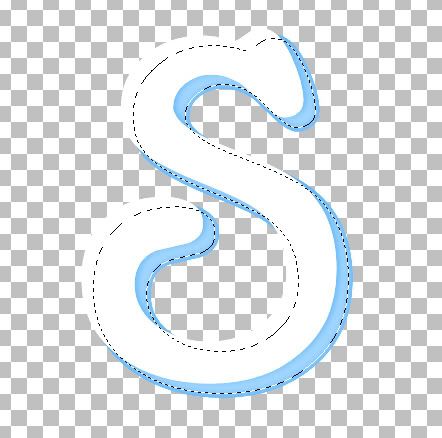
Photo Sharing and Video Hosting at Photobucket

18. When you've done that, hit the delete key, and move it into place in the S like we did before.
19. Go up to the "Selections" tab and choose "Select None".
20. With the "White" layer active, go up to the "Adjust" tab then to "Blur" then to "Gaussian Blur", and change the number to 3.50, and hit OK.
This is what you should have so far

Photo Sharing and Video Hosting at Photobucket

21. In the layer palette, click the Eye icon next to the S layer to turn it off and right click on any of the other layers and choose "Merge" then "Merge Visable" to merge the 2 highlight layers together.
22. Click the X over the S to make the layer visable again, and this time, click the Eye icon over the "Merged" layer to hide that one.
23. Click the S layer to make it the active layer.
24. Here's where EC5 Impact comes in. Go up to the "Effects" tab, then down to "Plugins", then find your "Alien Skin Eye Candy 5 Imapct" from the flyout and choose "Bevel". Use the settings below:
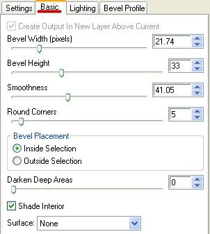
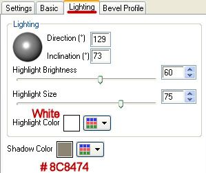
Photo Sharing and Video Hosting at Photobucket

Photo Sharing and Video Hosting at Photobucket

In the "Bevel Profile" tab, the bevel I used was "Button".

25. Unhide your Merged layer in the palette, and merge your 2 layers together using the "Merge Visable" command.
26. Now create a new layer, and with the snowflake tubes from the zip file, start placing them on your image as you like.

That's it, we are done :) It was kind of a long tut, but worth the effort I think.

Hearts and Swirls
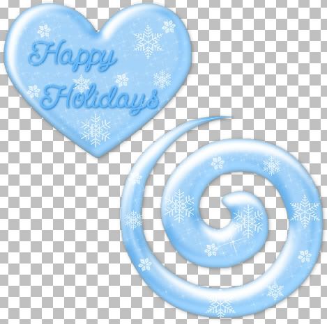
Photo Sharing and Video Hosting at Photobucket

Buckles
Photo Sharing and Video Hosting at Photobucket

Arrows
Photo Sharing and Video Hosting at Photobucket


TOU:

If you do this tutorial, your end result is yours to do whatever you wish; give it away as a freebie, use it as part of a kit, or sell it for profit. You may not make this into an action or script to give away as a freebie or to sell for a profit. A mention or a link back here would be appreciated but is not mandatory. Please do not share the supplies or tut through email or any other means, send them here to my blog to get the supplies and tut for themselves.
 
posted by Scrap Stuff by Shawna at 5:59 PM | Permalink | 17 comments
Friday, November 16, 2007
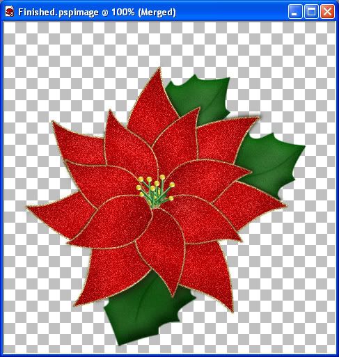
Christmas Flower
Supplies Needed:

Golden Sparkles.jpg
SK Christmas Poinsettia Leaf.pspShape Paste into your shapes folder
SK Golden Ball.tub Paste into your picture tubes folder
SK Leaf.tub Paste into your picture tubes folder.

Download Here


1. Start by opening a 500 x 500 transparent image.
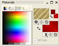
2. Set your foreground colour to #800000 and your background colour to #C00000. Then set your background to "Gradient", choose Foreground-background, Angle is 40, Repeats 1.
3. Go back to your foreground and set your "Pattern" to "Golden Sparkles.jpg" that was in the zip file, Angle is 0, Scale is 100.

Photo Sharing and Video Hosting at Photobucket

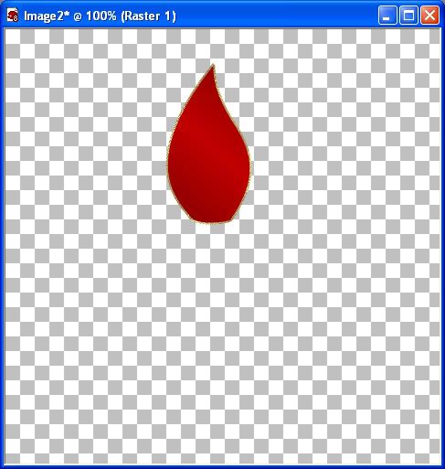
4. Go to your "Preset Shapes" tool and choose "SK Christmas Poinsettia Leaf". Set your "Line Style" to Solid, "Line Width" to 2.00, "Anti-alias" is checked, "Create as Vector" is also checked, and draw out your main leaf about the size of mine in the picture below.

Photo Sharing and Video Hosting at Photobucket

If you want to increase or decrease the size of the gold outline of the petal, in the layer palette to the right, click on the plus sign beside the layer called "Vector 1", then double click on the layer called "SK Christmas Poinsettia Leaf", and you can change the stroke width. When you are satisfied with it, click ok, and right click on "Vector 1", and choose "Convert to raster layer".
5. Rename that layer "Main Petal".
6. Now, right click on main petal, and from the flyout choose "Duplicate", and rename that one 01.
7. Go up to the "Image" tab, choose "Rotate", then "Free Rotate" and use these settings. Direction is "Right", Free is dotted, and change the number to 50. All layers and rotate single layer around canvas center are both not dotted.
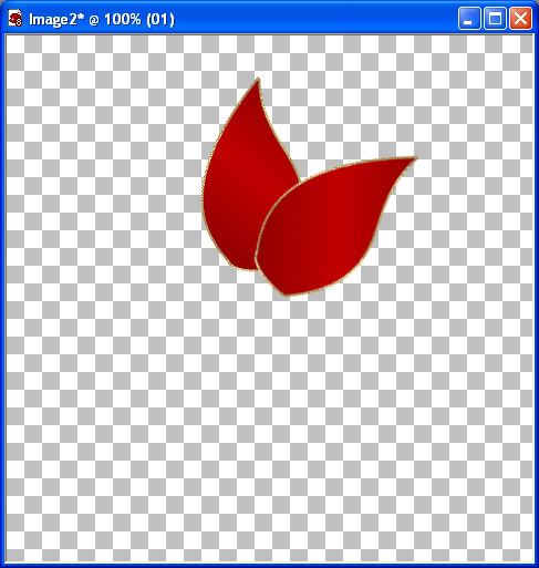
8. Take your "Mover" tool and move it like in the picture below.

Photo Sharing and Video Hosting at Photobucket

9. Click on "Main Petal" to activate that layer and right click and choose "Duplicate" and rename that to 02, and drag that layer to the top of the palette above 01.
Always duplicate the Main Petal because each time you duplicate something, it becomes a little less clear, so we don't want to copy a copy.
10. Go up to the "Image" tab, choose "Rotate" then "Free Rotate" and change the number to 85, and with your "Mover" tool, move that petal into place on your canvas.
11. Go to "Main Petal" in your layer palette, and duplicate it again. Rename it to 03, and move it to the top of the pile.
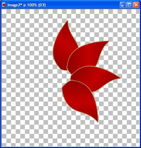
12. Go up to the "Image" tab, choose "Rotate" then "Free Rotate" and change the number to 140 and move it into place. You should have something that looks like this

Photo Sharing and Video Hosting at Photobucket

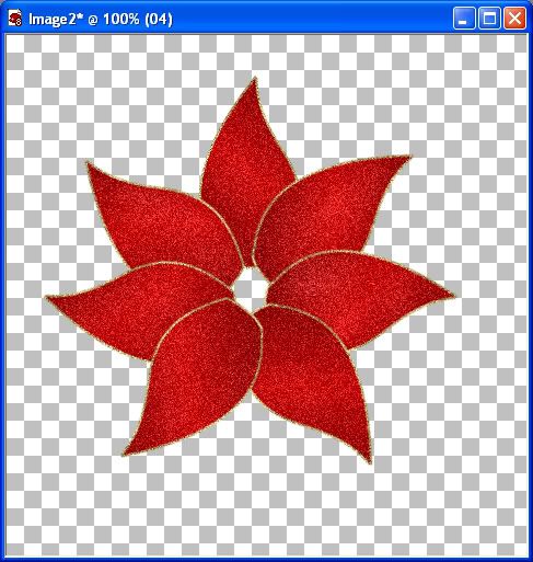
Now we need to the the other 3 petals for the left side. The steps are the same for the next 3 petals, except when you do the rotations, put the dot in the word LEFT. Use the same settings as well, 50, 85, and lastly 140. Remember to duplicate only the main petal, and to rename them 04 05 and 06, and move them to the top of the palette. When finished with that, you should have something like this

Photo Sharing and Video Hosting at Photobucket

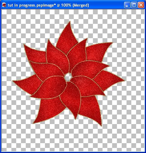
13. Now, merge all visable layers. You can leave it as is, or you can do just a tiny bit of shading in this next step. Go over to your Lighten/Darken tool, it's the half black half white octagon looking icon on the left. Choose the default round brush, size 43, hardness 50, step 25, density 100, thickness 100, rotation 0, opacity 46. Left clicking with your mouse will lighten and right clicking will darken. It's already a bit shaded because we've used a gradient as a fill, so I just lightened it a bit in certain areas. This is what I ended up with

Photo Sharing and Video Hosting at Photobucket

14. Now hold down your shift key and hit the d key to duplicate our image, and minimize it for later use.
15. Go up to the "Adjust" tab, then to "Add/Remove Noise" then to "Add Noise". Use these settings: Gaussian is dotted, Monochrome is checked, and Noise is 33%. You should have something that looks like this

Photo Sharing and Video Hosting at Photobucket

16. Unminimize our image from before we added the sparkly noise. Right click and merge all visable layers. Go up to the "Image" tab and choose "Resize". Make sure it's on "Percent" and not "Pixels"..... Change the width and height to 75%, Resolution is 300, Resampled Using is Bycubic, Lock Aspect Ratio and Resize All Layers are checked.
17. Go up to the "Image"tab and choose "Rotate", then "Free Rotate". Direction is "Right" "Free" is checked and set the number to 25 and hit ok.
18. Now add the noise to this layer again, using the same settings as before, in step #15. The reason I had you dulplicate this layer, rotate, then redo the noise is becasue when you rotate and resize it to 75%, it becomes a bit fuzzy and not as shiny. You can use the sharpen feature but I prefer not to as sometimes, it comes out looking too harsh.
20. Go up to the "Edit" tab and select "Cut", then paste as a new layer onto your first flower image.
21. I like to give my top flower layer the slightest shadow, but you can skip this step if you want. Go up to the "Effects" tab, then to "3D Effects" then to "Drop Shadow". Use these settings: Vert is 0, Horo is -1, Opacity is 50, Blur is 5.00, Colour is #221D12.
22. Repeat these steps again, except change the Vert to -1, and the Horo to 0.

Photo Sharing and Video Hosting at Photobucket

Now we are going to do the little thingys inside the middle of the flower.

23. Change your foreground colour to #276D27. Activate your pen tool and use these settings. Segment type is "Line Segments", Line Style is "Solid", Width is 3, Anti-alais and create as vector is checked. Using a blank space on your flower image, hold down your shift key and draw a straight line about the length of 2 squares on your image.
24. Right click on that layer and convert it to a raster layer. Give it a simple little bevel, anything is fine as long as it doesn't look so flat.
25. To give it a little bit of a curve to it, go up to the "Effects" tab, choose "Distortion Effects" then choose "Wave". Horozontal: Amplitude is 2, Wavelength is 51, Vertical: Amplitude is 1, Wavelength is 25, and Transparent is dotted.
25. Now drag that over into the hole in the middle of your flower. Copy and paste that 7 or 8 times, and mirror a few of them so that they aren't all going in the same direction. (Mirror is in the image tab)
26. Click on your Picture Tube tool and find SK Gold Ball. Set the size of your Golden Ball at 11, and place one on each of the green thingys in the middle. You may want to make a new layer for each one so that you can move it into place.
Also, I just made a new layer, placed it behind my 2 flower layers and filled it with tiny gold balls to fill in the spaces.
I've also included a leaf tube if you want to use it. Shading and making leaves was never something I was very good at, but that's ok, most of it is hidden behind the flower anyway ;) You may want to add about 6% noise to the leaves as well.

That's it, we are done. Here's the final product

Photo Sharing and Video Hosting at Photobucket

TOU:

If you do this tutorial, your end result is yours to do whatever you wish; give it away as a freebie, use it as part of a kit, or sell it for profit. A mention or a link back here would be appreciated but is not mandatory. Please do not share the supplies or tut through email or any other means, send them here to my blog to get the supplies and tut for themselves.
 
posted by Scrap Stuff by Shawna at 9:10 PM | Permalink | 9 comments
Thursday, November 15, 2007
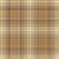
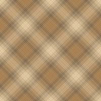
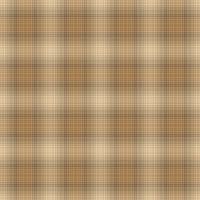
Make Plaid the Easy Way
I've tried at least 4 different tuts from various sites on how to make a plaid pattern, but I didn't really care for the results. One came out looking like it had really strong, bright lines in half of the pattern, another looked too blurry. I had trouble with some of the filters working with the picture I had chosen as well. So, I fiddled around, and came up with my own way of doing it that I like much better.


Supplies need for this tutorial: 1 target picture, and 3 filters.
Picture: Get It Here
Filter: Birgit's Chaos - Embroidery Get It Here
Filter: Simple - Diamonds - Get It Here
Filter: Simple - 4 Way Average - Get It Here


1. Open up target image SK Target Plaid Pic.jpg in PSP, or one of your own choosing. Your image must be square for this to work correctly.
2. This one is already resize 200 x 200 for you, but if yours is not, resize it now by going to the "Image" tab, then to "Resize". In the "Pixel Dimensions" change the width and height each to 200 pixels, "Resolution" is 300, and you may need to uncheck "Lock Aspect Ratio".
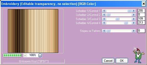
3. Go up to the "Effects" tab, and then to "Plugins", and from the flyout choose "Birgits Chaos", then choose "Embroidery". The picture below shows the settings we are using.

Photo Sharing and Video Hosting at Photobucket

For a closer look at what your pattern will look like, change the picture preview too 100%.

If you are doing this tutorial with a different picture than the one provided, you may need to change the sliders to something other than what I have given you. Also, if you want a smooth look to your plaid, or a slight pattern, move the "Stripes or Pattern" slider to the right or left.


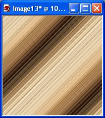
4. Go up to the "Effects" tab and then to "Plugins". From the flyout
choose "Simple" then "Diamonds". Your picture should have turned into this

Photo Sharing and Video Hosting at Photobucket

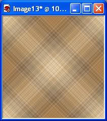
5. Next, go back to the "Effects" tab, then to "Plugins", then choose "Simple" then "4 Way Average. Your picture should look like the one below

Photo Sharing and Video Hosting at Photobucket

That's it. You're done. Try applying the "Diamond" filter once or twice more to get a different effect.

Once:

Photo Sharing and Video Hosting at Photobucket

Once Again:

Photo Sharing and Video Hosting at Photobucket

One More Time:

Photo Sharing and Video Hosting at Photobucket

TOU:

If you do this tutorial, your end result is yours to do whatever you wish; give it away as a freebie, use it as part of a kit, or sell it for profit. A mention or a link back here would be appreciated but is not mandatory. Please do not share the supplies or tut through email or any other means, send them here to my blog to get the supplies and tut for themselves.
 
posted by Scrap Stuff by Shawna at 6:59 PM | Permalink | 11 comments
Tuesday, November 6, 2007
Threading a Ribbon Through a Buckle
Supplies needed for this tutorial: a copy of PSP (can also be done in photoshop very easily), SK Ribbon, SK Buckle, and SK Ribbon Tail, these last 3 are included in the zip, along with PSD and PNG files.

Download Supplies Here

1. Start by opening up the ribbon, buckle and tail images in PSP. Hold down your shift key and hit the D key to duplicate each image and close out the originals.
2. Name your ribbon layer Base Ribbon. Copy and paste your buckle twice onto your base ribbon layer and name these buckle top, and buckle bottom.
3. In your layer palette to the right, arrange the 3 layers like this: buckle top is first, then base ribbon, then buckle bottom is the third layer.
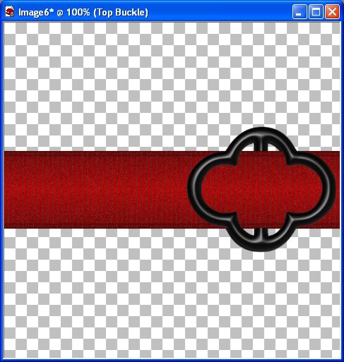
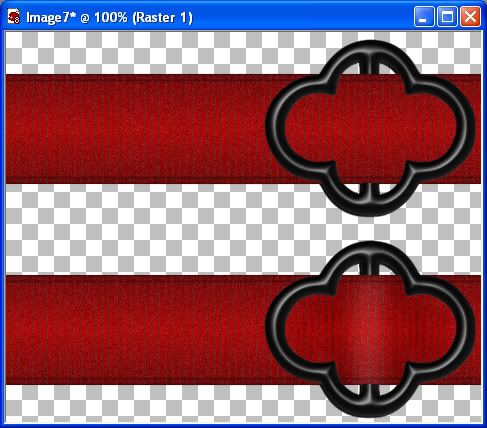
4. Arrange your buckle top and buckle bottom evenly over top of each other and the ribbon (if it isn't already) so it looks like its just one buckle like in the picture below.

Photo Sharing and Video Hosting at Photobucket

Next, we are going to get rid of part of the bar in the middle of the buckle. This next step, there are 2 ways to do this. One is to use your eraser tool, the other is the rectangle tool. I prefer the rectangle tool, because it gives a cleaner line.

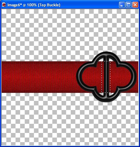
5. Make sure your buckle top layer is active (it should be highlighted in the layer palette to the right), and select your "Selection" tool at the left, set it at "Rectangle", Mode=Replace, Feather=0, Anti-alias is checked, and draw out a rectangle, stopping at the top and bottom of the ribbon. See the picture below.

Photo Sharing and Video Hosting at Photobucket

6. Now, hit your delete key, then go up to the "Selections" tab and hit the "Select None" option and look at your image. If you've gone too far up or not far enough, go to the "Edit" tab, click "Undo Select None", back up to the "Edit" tab and click "Undo Clear" and back up to the "Edit" tab, and click "Undo Selection", and then try it again. It should look like the picture below.

Photo Sharing and Video Hosting at Photobucket

Now, we are gonna do some highlights and shadows to make it look more realistic.

7. On your tools palette to the left, click on the drop down arrow on the icon that looks like a black and white octogon Photo Sharing and Video Hosting at Photobucket and choose
lighten/darken. Change your settings to this: Brush shape is the PSP Default Round, Size is 37, Hardness is 25, Step is 25, Density is 100, Thickness is 100, Rotation is 0, Opacity is 55.

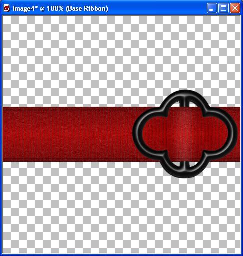
With this Lighten/Darken tool, when you left click on your item, it will lighten the area, when you right click it will darken an area. If this were a real ribbon and buckle, the ribbon in the center of the buckle would be raised up a bit, making it appear lighter in that area, and the areas to the right and left of the highlighted part would appear to be a bit darker. That's the look we want to achieve here with our Lighten/Darken tool.

8. Make sure your Base Ribbon layer is active, hold down your left mouse button, and make one even stroke down your ribbon. You may need to undo and practice a few times to get the look you want. It should look similar to the picture below.

Photo Sharing and Video Hosting at Photobucket

9. Leave your settings the same, except change the Brush Size to about 25. Now, we want to darken the spaces a bit on each side of our newly highlighted middle stroke. With your right mouse button and using the same technique as you did for the lightening stroke, darken it a bit on each side, and then a little bit towards the circular parts of the buckle.

Photo Sharing and Video Hosting at Photobucket

Notice how the ribbon doesn't look so flat and one dimensional anymore?

Photo Sharing and Video Hosting at Photobucket

That part's done. Now, we are going to put on the ribbon tail.

10. Unminimize SK Ribbon Tail. Go up to the "Image" tab at the top, and choose "Rotate" then "Free Rotate". Use these settings: Direction is left, Dot in the word "Free", and put in 10.00 and hit OK. If your tail doesn't seem as sharp, shapen it once under the "Adjust" tab.
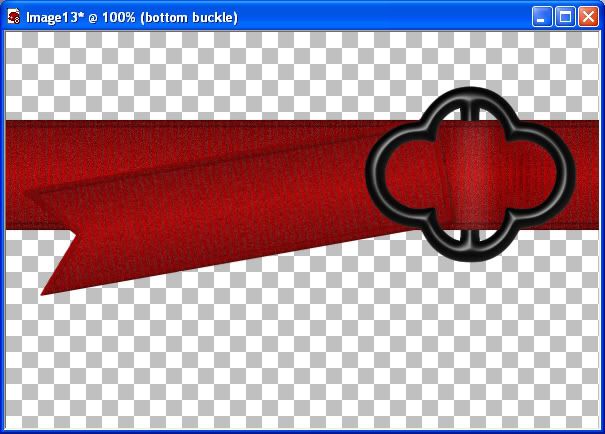
11. Copy and paste your tail onto your other image, and name it tail, and place it under top buckle. This is where you should be at

Photo Sharing and Video Hosting at Photobucket

12. Now we need to erase that visable extra part of our tail. Make your tail layer active, click on your eraser tool, and erase that extra part covering up our middle section in the buckle. Don't worry, you won't affect your buckle if your tail is the active layer.
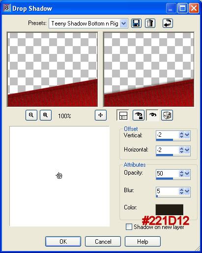
13. The tail kinda blends into the ribbon so we are going to give it a tiny drop shadow to make it stand out a bit more on its own. With your tail layer still active, go up to the "Effects" tab, go to "3D Effects", then to "Drop Shadow". Use the settings below.

Photo Sharing and Video Hosting at Photobucket

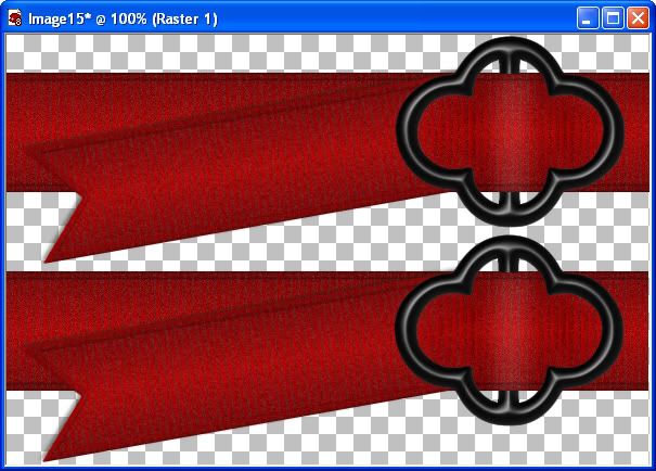
14. Merge all visible layers and you are done :-)

Photo Sharing and Video Hosting at Photobucket

Tip: You may want to moosh (yes, moosh is a word lol) it in a bit where the ribbon meets the tail to give it an extra realism effect. On your tool bar to the left, select your "Mesh Warp" tool. Change the mesh horizontal to 28 and mesh vertical to 22, symmetric is unchecked, show mesh is checked. Select one of the little nodes close to the circular part of the buckle, and just slightly push it towards the tail. Do this to a few of them till you have your desired look.

TOU:

If you do this tutorial, your end result is yours to do whatever you wish; give it away as a freebie, use it as part of a kit, or sell it for profit. A mention or a link back here would be appreciated but is not mandatory. Please do not share the supplies or tut through email or any other means, send them here to my blog to get the supplies and tut for themselves.
 
posted by Scrap Stuff by Shawna at 7:00 PM | Permalink | 14 comments
Saturday, November 3, 2007
Christmas Bulb
This tutorial is written for PSP users, but can easily be done in Photoshop or any other graphics program you are familiar with. The bulb shape I have made is for PSP, but I have also included in the zip file a copy of it in PSD, JPG, PNG, and PSPimage format. I think I've covered all of the bases there for those using something other than PSP.
Supplies needed for this tutorial: A copy of PSP, SuperBlade Pro is optional, SK Christmas 29 Shape, SK Bulb End font. The last 2 are in a zip file which you can get Here. Place the SK Christmas 29 shape into your "My Preset Shapes" folder or wherever you have your shapes stored.


1. Start by opening a 500 x 500 transparent image.
2. Click on your preset shapes tool, and select the shape SK Christmas 29.
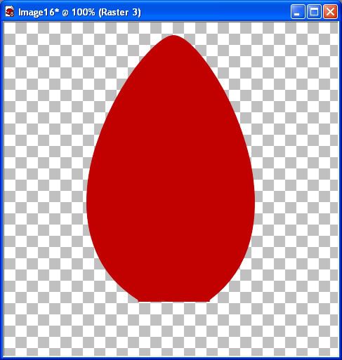
3. Set your foreground and background colour to #C00000, create as vector is checked, anti alias is checked and a width of 1, and draw out your shape.
4. In your layer palette to the right, right click on vector 1 and choose "Convert to Raster Layer".
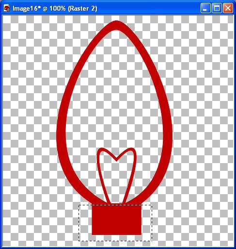
5. Next, we are going to get rid of the middle and bottom, square part of the bulb. Click on your "Selection Tool" to the left and change it to "Rectangle", and starting from the bottom going upwards, draw out a rectangle shape, stopping at the point that I have in the picture below.

Photo Sharing and Video Hosting at Photobucket

6. Now hit your delete key and go up to the "Selections" tab and click on "Select None".
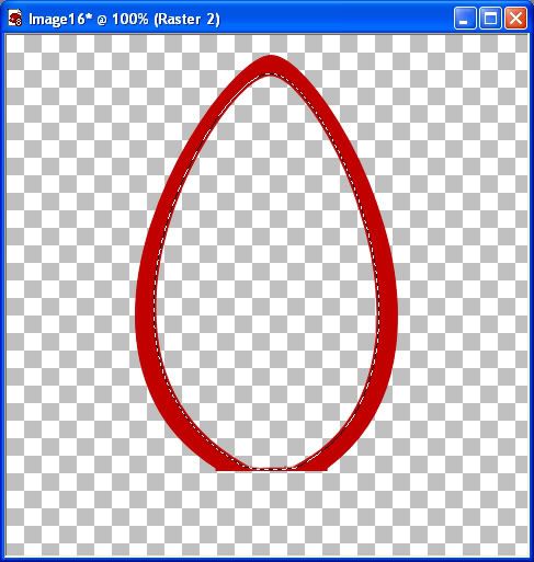
7. Click on your eraser tool, and erase the wire looking part in the middle, being carefull not to erase any of the sides of the bulb itself. Your image should look like the one below.

Photo Sharing and Video Hosting at Photobucket

8. Click on your magic wand tool with these settings: Mode is Replace, Match Mode is RGB Value, Tolerance is 30, Feather is 0, Anti-alias is checked. Make sure your bulb layer is selected (it should be the one highlighted blue in the layer palette to the right) and click once in the middle of your bulb. You should have marching ants all around the inside of your bulb.
9. Next, go up to the "Selections" tab, choose "Modify", then choose "Expand", and set the number of pixels to 3. Your marching ants should have moved 3 pixels into the red area of your bulb like in the pic below.

Photo Sharing and Video Hosting at Photobucket

10. Go up to the "Layers" tab and choose "New Raster Layer".
11. Click on your flood fill tool, and on the new raster layer, click once in the middle of your bulb to fill it with our red colour.
12. Go up to the "Selections" tab and choose "Select None". Your bulb should now be solid red as in the picture below.

Photo Sharing and Video Hosting at Photobucket

13. In your layer palette to the right, right click on one of the layers and choose "Merge" and from the flyout choose "Merge Visable".
14. Go up to the "Selections" tab and choose "Select All", back up to the "Selections" tab and choose "Float".
15. Go up to the "Layers" tab and choose "New Raster Layer".
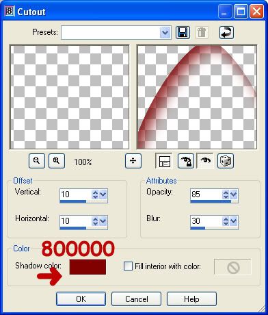
16. Go up to the "Effects" tab and choose "3D Effects" then choose "Cut Out" and change it to the settings below.

Photo Sharing and Video Hosting at Photobucket

17. Go up to the "Layers" tab and choose "New Raster Layer".
18. Go to the "Effects" tab and choose "3D Effects" then choose "Cut Out" and keep the settings the same except change the vertical and horozontal from 10 to -10 each, and click OK.
19. Go up to the "Selections" tab and choose "Select None".
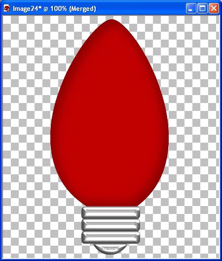
20. In the layers palette, right click on one of your layers and choose "Merge" then "Merge Visable".

This next part requires SuperBlade Pro. If you don't have it, you can just use a silver gradient and give it a bevel from the 3D Effects tab in PSP.

21. Change your foreground and background to white.
22. Double click on the SK Bulb End Font from the zip file and minimize it. Select the "Text" tool, and find "SK Bulb End" in the list of fonts. Change to these settings: Create as vector checked, Size is 200 (may vary depending on what size bulb you made), Stroke width is 1, Anti alias is checked.
23. Type out a capitol A onto your bulb layer, and right click "Vector 1" in your layers palette and change it to a raster layer.
24. Go up to the "Selections" tab and choose "Select All", back up to the "Selections" tab and choose "Float", and back up to the "Selections" tab and choose "Defloat".
25. Next, go to the "Effects" tab, choose "Plug ins", then to "Flaming Pear/Super Blade Pro". I have used a preset called JLSilver, but cannot remember where I got this. (If it is yours, or you know where this came from, let me know and I will give you credit, and post the link to it here.) Use one of your choosing that you think looks good, playing with the different bevel settings.
26. Go up to the "Selections" tab and choose "Select None".

I thought it would look better without the spaces between each bar, so what I did was selected each bar with my rectangle tool, and copied and pasted each as a new layer, moved them together and then merged those layers together.


At this point, you are pretty much done. All that is left to do is to merge all visable layers and you've got yourself a Christmas bulb.

Photo Sharing and Video Hosting at Photobucket

Photo Sharing and Video Hosting at Photobucket

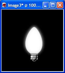
TIP: If you would like to give your blubs a little glow, after merging your layers in step 13, hold down your shift key and hit the D key to duplicate that layer. Go up to the "Adjust" tab, choose "Blur" then choose "Gaussian Blur" and set the radius number to somewhere between 4 and 8. Copy and paste that onto your bulb layer, placing it behind your solid red bulb.
TOU:

If you do this tutorial, your end result is yours to do whatever you wish; give it away as a freebie, use it as part of a kit, or sell it for profit. You may not make this into an action or script to give away as a freebie or to sell for a profit. A mention or a link back here would be appreciated but is not mandatory. Please do not share the supplies or tut through email or any other means, send them here to my blog to get the supplies and tut for themselves.
 
posted by Scrap Stuff by Shawna at 1:29 PM | Permalink | 20 comments