Saturday, February 16, 2008
Extending a Line Brush to Make an Overlay
This tutorial is for PSP users only. It uses a script that is not for use in Photoshop.

Supplies Needed:

My striped line brush which you can get Here.
Script: Pattern Extend by Joske which you can download from Here. Extract the script to your Scripts-Restricted folder
MuRah's Meister Copies: Download the plugin Here.

I have 2 sets of different line brushes, which you can download from:

Set #1
Set #2


These brushes are all 500 pixels in length, which, unfortunately, is the size limit for psp brushes, at least it is for PSP8 which is what I use. This tutorial will show you how to extend them using a script to give you a perfectly seamless overlay of any size for creating background papers. If you haven't already, install your brushes now.

** If you are installing all of these brushes, copy and paste all into your Brush folder, wherever that may be on your computer. Each PSP brush always has 2 files for one brush. One will be called BrushTip_BrushNameHere.PspScript and the other is BrushNameHere.PspBrush. If you are installing just a single brush (we are going to be using SK Lines 17 for this tutorial), then you have to copy both of these files into your brush folder (BrushTip_SK Lines 17.PspScript and SK Lines 17.PspBrush).

** When the rest of this set becomes available for a freebie on my blog, these are the dimensions of each brush. It is easier and a lot less work for you if you know the exact dimensions of the brush we are going to extend, so here are the dimensions for brushes 1 to 18:

SK Line Brush 01: 8 x 500
SK Line Brush 02: 14 x 500
SK Line Brush 03: 23 x 500
SK Line Brush 04: 16 x 500
SK Line Brush 05: 15 x 500
SK Line Brush 06: 18 x 500
SK Line Brush 07: 25 x 500
SK Line Brush 08: 35 x 500
SK Line Brush 09: 11 x 500
SK Line Brush 10: 17 x 500
SK Line Brush 11: 21 x 500
SK Line Brush 12: 26 x 500
SK Line Brush 13: 23 x 500
SK Line Brush 14: 25 x 500
SK Line Brush 15: 34 x 500
SK Line Brush 16: 25 x 500
SK Line Brush 17: 45 x 500
SK Line Brush 18: 30 x 500

Let's get started.....

1. Open up a new transparent image 45 x 600. I know our brush is 500 pixels in length, but it's easier if we have a bit of space at the top and bottom.
2. Set your foreground colour to black and go up to Layers, New Raster Layer. Position your line brush evenly at the edges of your canvas and click once. You should have this:

Photobucket

Now, since we are only going to be extending this image vertically, it does not matter if there is extra space at each of the sides, but there CAN NOT be any extra space at the top or bottom or it will show in your final product. See example below

Photobucket

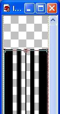
3. So now we need to crop the space away. Click on your Crop tool and position it so that it is just going to crop off a tiny bit from the top and bottom edge. See example below.
Photobucket

4. Make sure your active layer is the one with your brush on it. Go up to the Scripts panel and find PatternExtend-joske and select it from the drop down menu.

*If you are not familiar with Scripts, look up at the top of your screen for the section that looks like this Photobucket

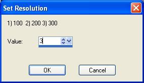
5. Next, push the arrow pointing to the right to start the script. The first box that pops up is the resolution box. I got into the habit of setting it at 300 so that's what I usually do. Pick your resolution and click OK.
Photobucket

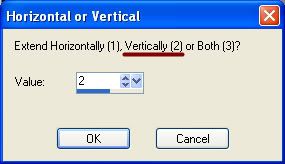
6. We are only extending this vertically, so set the number to 2 for just vertical.
Photobucket

*This next part is where we set the new height. The script uses inches, and I usually just use pixels so it took a bit of trial and error to find out what it converted to.

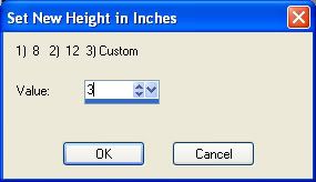
7. Set this next number to 3 for Custom.
Photobucket

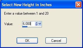
*Another box pops up and you can input whatever height you want. If you are like me and use pixel values, setting the custom number to 1 will give you a height of 300, setting it to 2 will give you a height of 600, setting it to 3 will give you a height of 900, and so on and so on. It uses a mulitple of 3.

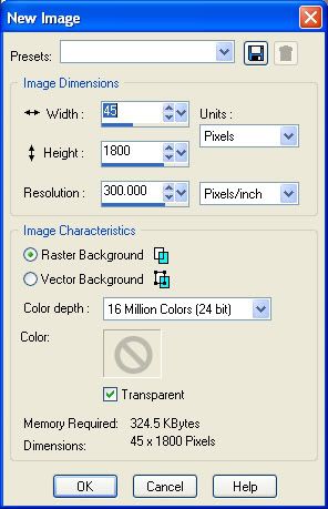
8. We are going to make this 1800 pixels high, so set your custom number to 6 and click OK.
Photobucket

*This next box shows you the dimensions that you have chosen. 45 pixels wide, 1,800 pixels wide, with a resolution of 300. If you want to change anything, you can do so now by typing in new numbers and clicking OK.
Photobucket

9. This next little pop up tells you to find your original image in the materials box. When you click on OK, your foreground materials box should pop up automatically with the pattern tab open. From the drop down box, find your brush image you are working on here and click OK.

*The script will automatically extend your brush pattern to the dimensions that we previously had set. You should now have a 45 x 1800 pixel even strip :) If yours is not seamless vertically, then you may have left a space in there when you cropped it.

*If you are continuing on to the next part, don't delete your brush off of your canvas.

*That's how to extend a Line Brush vertically. You can either use it this way and copy and paste it onto a new, larger background paper, spacing it that way OR continue on and I'll show you how to entend it evenly across the page using this script, and also another way using MuRah's Meister Copies plugin.


Extending the Brush Horozontally Using Pattern Extend:

Since this brush is already the height that we want it, we aren't going to touch that. We just need to reproduce it across our page horozontally. In order to do that, we need to decide how much space we want inbetween each set of stripes.

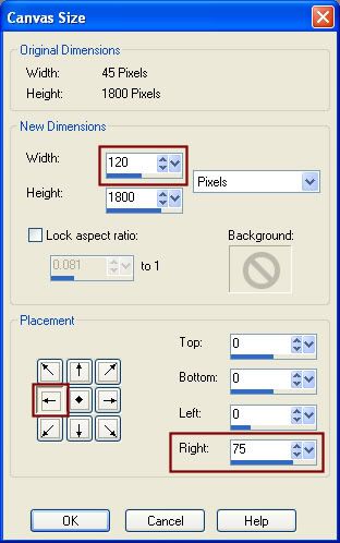
1. Go up to the Image tab at the top and then down to Canvas. At the top of the box that pops up is our original width and height of our canvas, 45 x 1800. Below that is where we type in what we want our new canvas to be. To make things easier, in the width column, change it to 45 right now. That way, we just add on the number of pixels we want and there is no confusion. We are leaving the Height at 1800, but now we need to decide how many pixels we want in between each of our block of striped lines. I'm going to choose 75 pixels. See picture below.
Photobucket

2. So, I would add 75 onto the 45 in the width column, which would give me a number of 120 in the width column. Make sure the Lock Aspect Ration is unchecked because we are only changing the width. Don't hit ok yet.
3. In the next part where it says Placement, click the arrow I've highlighted in red. The number 75 should appear beside the column that says Right. That means that we are going to have 75 pixels of space to the right of our line brush on the canvas. Now click on OK.

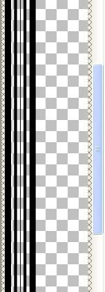
Yours should now look like this:
Photobucket

This is where we use the Pattern Extend script.

4. Go up to the Script tab, it should still have the Pattern Extend script in it and push the arrow pointing to the right to start it up.
5. Choose your resolution
6. Choose 1 for the horozontal option.
7. Choose 3 for the custom option.
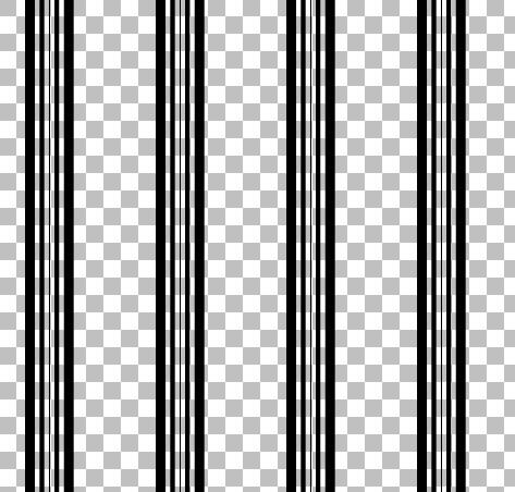
8. Choose your new width. If you are using pixels, like in the vertical tutorial, 1 will give you a page width of 300, 2 will give you a page width of 600 ect....... I want an 1800 x 1800 page, so I'm going to choose 6.
9. Find your canavs in the patterns tab and hit ok.

You should now have an 1800 x 1800 page with evenly spaced stripes across :)
Photobucket

*You can also go up to the Edit tab, choose Copy, and paste that onto a blank 1800 x 1800 page and it will center it so that there is equal space at each of the sides if you like that look better.


Extending Horozontally Using MuRah's Meister Copies:

This is a much quicker way to spread it across the page once you have extended your brush to the verticle length you wanted it.

1. Open up a new transparent canvas 1800 x 1800.
2. Copy and paste your 1 extended brush onto the page. It will automatically be centered in the middle of the canvas.
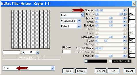
3. Go to the Effects tab, then to Plugins, then find MuRah's Meister, then to Copies. Put your settings like the ones in the picture below
Photobucket

*At the top, I've indicated the Number slot with a red arrow. If you change that number to something higher, more copies of your line brush will appear on your page. Change it to something lower than 9, and less will appear. Just hit OK when you are satisfied, and you are done :)

The full set of 18 Line Brushes are now up on my blog. You can download them from HERE
 
posted by Scrap Stuff by Shawna at 3:25 PM | Permalink | 16 comments
Textured Overlay
This is not a tutorial teaching you how to make textures, this is a tutorial showing you how to use premade textures you find on the net. It will show you how to use the blend modes to get different effects for textured paper.

There's tons of high resolution texture sites out there. All you need to do is google for them, but here's a few sites that have free downloadable textures for you to use. I've included a 500 x 500 sample texture to use for this tutorial, but if you were creating a background paper that was anywhere from 1800 pixels to 3600 pixels, obviously the 500 x 500 texture file would be too small to use. You would have to resize it to the exact same size as your page, or find a high resolution texture somewhere on the net for your project.

Morguefile.com
cg textures.com
Texture King
Texture Warehouse


I've included a 500 x 500 sample texture to use for this tutorial. You can download it Here.

1. Start by opening up the 500 x 500 texture for tut.png from the zip file.
2. Create a new 500 x 500 transparent canvas.
3. Decide what colour you want your paper to be and set that as your foreground colour in PSP. I'm going to use Red #C00000.
4. Flood fill your transparent canvas with your chosen colour.
5. Click on your texture canvas to make it the active one, and go up to the Edit tab, and choose Copy.
6. Click once on your coloured canvas to activate it, then go up to the Edit tab and choose Paste, then Paste as New Layer.

Your grey texture layer should now be over top of your coloured layer. Now we need to change the Blend Mode so we can see the textured layer over the coloured layer.

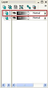
7. In the layer palette on the right, if it isn't already, make your textured layer the active one (It should be the one called Raster 2 and be the top layer). Where it says Normal, that is the Blend Mode section.

Photobucket

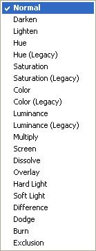
8. Click on the arrow that is beside the word Normal and a drop down box should appear with all of the different blend modes.

Photobucket

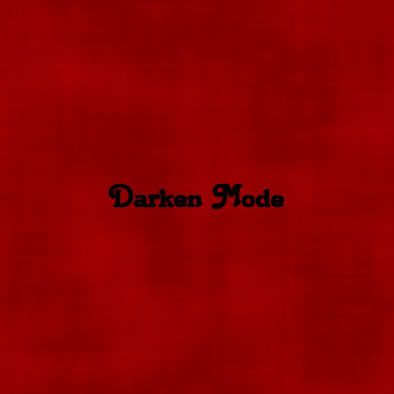
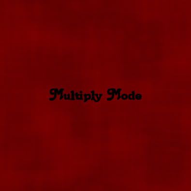
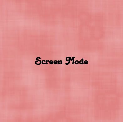
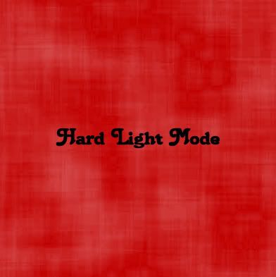
Click each one and watch how your texture changes. It blends in with your chosen colour of your paper. Each blend mode will give you a different look. It will also change with whatever colour you have as well. Some blend modes look better with certain colours than others, so you'll have to experiment and see what looks good to you. You can also play with the Opacity slider on the texture layer.

Photobucket

Photobucket

Photobucket

Photobucket

When you find something that looks good, just right click on one of the layers and merge visable.
 
posted by Scrap Stuff by Shawna at 3:15 PM | Permalink | 10 comments
Make a Sparkle Brush and then a Tube
Photobucket

Making the Brush:

1. Open up a 400 x 400 transparent image.
2. Set your forground and background to black.
3. Select your Preset Shapes tool, and choose Rounded Rectangle.
4. Draw out your rectangle in the middle of the page.
5. In the layer palette to the right, right click on Vector 1 and choose Convert to Raster Layer.
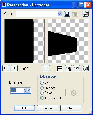
6. Go up to the Effects tab, then to Geometric Effects, then to Perspective Horozontal. Use the settings in the picture below.

Photobucket

7. Now we need to do the same to the opposite side, so go up to the Image tab, and choose Mirror.
8. Go to the Effects tab, Geometric Effects, Perspective Horozontal, use same settings.
9. Mirror the image.
10. Go to the Effects tab, Geometric Effects, Perspective Horozontal, use same settings.
11. Mirror the image.
12. Go to the Effects tab, Geometric Effects, Perspective Horozontal, use same settings.
13. Mirror the image.
14. Go to the Effects tab, Geometric Effects, Perspective Horozontal, use same settings.
15. Mirror the image.
16. Go to the Effects tab, Geometric Effects, Perspective Horozontal, use same settings.

Phew, finished that part.

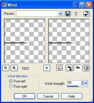
17. Now, we need the ends to be a little bit narrower and a bit more transparent. So, go up to the Effects tab and choose Distortion Effects, then Wind. Use these settings.

Photobucket

18. Mirror the image and go to the Effects tab, choose Distortion Effects, then Wind and use the same setttings.

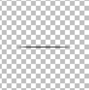
You should end up with something like the below picture. If your's is fatter, then you may have missed doing one of the perspective horozontal steps.

Photobucket


Hold down your shift key and hit the D key to duplicate our canvas for later use. You can minimize it for now.

We need to put this first horozontal line in the middle of our canvas, so...

19. Go up to the Edit tab, choose Cut, then back up to the Edit tab, and choose Paste as New Layer.
20. Now we need a vertical line to overlap that one. Go up to the Edit tab, this time choose Copy, then back up to the Edit tab, and choose Paste as New Layer.

You won't see much of a difference on your canvas because both these line are in the exact same place. We need to rotate the second line into a vertical postion.

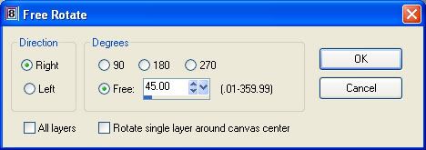
21. Go up to the Image tab, choose Rotate, then choose Free Rotate. Use the settings in the picture below.

Photobucket

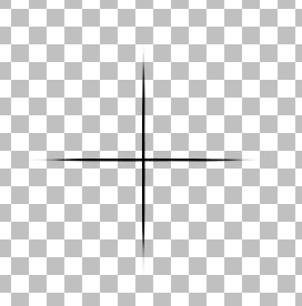
You should now have what looks like a cross on your canvas.

Photobucket

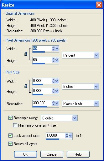
Unminimize our duplicated canvas. The lines that criss cross the star are usually shorter in length so we need to resize this just a bit smaller.

22. Go up to the Image tab, choose resize and use the setting in the picture below.

Photobucket


Now we want to copy and paste that onto our Cross layer...

23. Make sure the smaller resized layer is your active layer and then go up to the Edit tab, choose Copy.
24. Click on your Cross canvas to make this one the active canvas, then go back up to the Edit tab, choose Paste as New Layer.

Again, you won't see a difference on your image because it is in the same spot as the longer horozontal line.

25. Go up to the Image tab, choose Rotate, then choose Free Rotate. Use the settings below.

Photobucket

26. Go up to the Edit tab again, and choose Paste as New Layer. The final smaller line is now on your canvas in the horozontal position.
27. Go up to the Image tab, choose Rotate, then choose Free Rotate. Use the same settings, but put the green dot beside the word LEFT this time. You should have what looks like this:

Photobucket

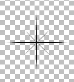
At this point, if you want to make a white tube out of this, hold down your shift key and hit the D key to duplicate this image. Minimize it for a bit later.

You can leave this brush as it is, to use as a main template for your sparkle brushes, and then you can click on your airbrush tool, and choose a soft round brush and plop a dot in the center. To finish off the brush, in the layer palette to the right, right click on one of the layers and choose Merge Visable. Then go to the File menu, go to Export, then to Custom Brush. Give it a name and click on OK and you're done.


Turning This Brush Into a Tube:

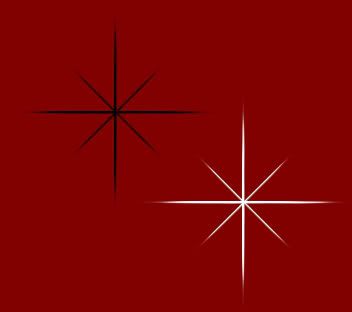
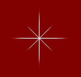
I've used a red background just so you can see the white star better.

Photobucket

If you haven't already, merge visable all layers. Go up to the Adjust tab, at the bottom choose Negative Image. Your black brush has now turned into a white image which you can save as a template and decorate as many sparkles as you want. Then to tube it, crop off the extra space all around, go to the File menu, choose Export, then choose Picture Tube, give it a name and your done :)
 
posted by Scrap Stuff by Shawna at 2:59 PM | Permalink | 13 comments
Polka Dot Pattern Fills
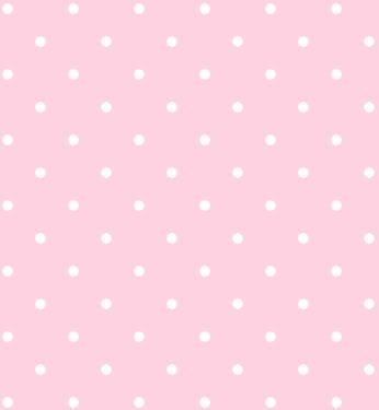
This tutorial will teach you to make your own seamless polka dot pattern fills and overlays.

Photobucket

Supplies Needed:

MuRa's Meister Copies which you can download Here.

1. Start out by opening a 200 x 200 transparent image.
2. Choose a colour for your background. I'm going to use Pink #FED2E1, and flood fill your canvas with it.
3. Next, choose a colour for your polka dots. I'm going to use white. Set your foreground and background to your chosen polka dot colour.
4. Click on your preset shapes tool, and set it to ellipse, and draw out one single dot.
5. When you get it to the size you like, right click on Vector 1 in the layer palette to the right and choose Convert to Raster Layer.
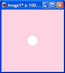
6. Now, we need this dot to be exactly in the center of your canvas, so make sure your dot layer is active (highlighted blue), and go up to the Edit tab, choose Cut, then choose Paste, then Paste as New Layer. It should now be in the exact middle of your canvas like this:

Photobucket

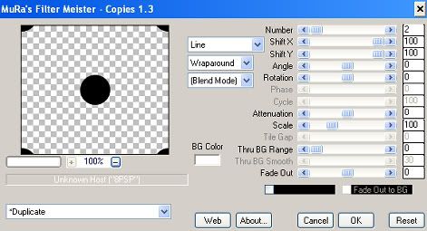
7. Make sure your Dot Layer is active, go up to the Effects tab, choose Plugins, then find MuRah's Meister and choose Copies. Put your settings like the one in the picture below. I've changed my dot to black so you can see it better in the preview pic.

Photobucket

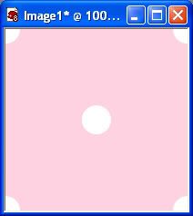
8. You should now have on your canvas a full dot in the center, and a partial dot in each of the 4 corners like below.

Photobucket

9. In your layer palette to the right, right click on one of the layers and from the flyout choose Merge, then Merge Visable.
10. Set your new polka dot pattern fill as your foreground pattern and fill a 500 x 500 transparent image as a try out. Keep in mind, that you don't have to use just polka dots, you can use pretty much any shape you like. Now on to the Overlay part.

Overlays:

This is very simple. Follow the steps 1 through 8 from the above tutorial. Don't Merge the layers. All you do is delete every layer EXCEPT the polka dot layer. Just set that as your foreground pattern and fill as many pages as you like. Simple huh :) Save it as a .psp file and use it as a template for other projects.

TOU:

If you do this tutorial, your end result is yours to do whatever you wish; give it away as a freebie, use it as part of a kit, or sell it for profit. A mention or a link back here would be appreciated but is not mandatory.
 
posted by Scrap Stuff by Shawna at 2:54 PM | Permalink | 27 comments