Thursday, June 12, 2008
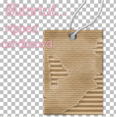
Ripped Cardboard-Requested Tut
Photobucket


Supplies Needed:

Texturizer plugin which you can download HERE
My 3 cardboard jpg's. Download all from HERE


I'm using a simple rectangle shape for this tutorial. After you've gotten this technique down, you can use any shape you want. So that we match up, use a rectangle shape while doing this tutorial.


1. Open up a new transparent image.

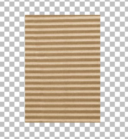
2. Set your foreground and background to SK Corrugated from the zip.

3. Click on your Preset Shapes tool and choose Rectangle, create as vector and anti-alias both are checked and a line width of 1.

4. Draw out a rectangle.

Photobucket

* We are going keep our image we just dragged out as a Vector image and duplicate our layer 1 more time.

5. In the layer palette, right click on Vector 1 and from the flyout choose Duplicate.

6. Open up 1 of the 2 paper jpg's from the zip. I'm using SK Cardboard Paper 02.

7. In the layer palette, click on the small + sign beside the duplicated layer. Under Copy of Vector 1 will be another title. Mine says Rectangle because that's the name of the shape I drew out. Yours may say something else if you used another shape.

8. Double click on the word Rectangle and a properties box will pop up.

9. Double click on the picture icon under the word Stroke. From the dropdown box, find either SK Cardboard Paper 01 or 02, whichever one you opened up from the zip. Click on it to select it then hit OK.

10. Do the same for the Fill box and hit OK when you have changed both of those to your chosen paper swatch.

* You should have 2 different layers now. One with your corrugated cardboard and another with your chosen paper from the zip. If it isn't, move your paper layer above the corrugated layer.

11. In the layer palette on the right, right click on each of your vector layers and from the flyout choose Convert to Raster Layer.

12. On your paper layer ( not corrugated layer) Go up to the Effects tab at the top, then to 3D Effects, then to Inner Bevel and use these settings:

Photobucket

13. Click on your Freehand Selection tool on the left. Selection type is Freehand, Mode is Replace, Feather is 0, Smoothing is 0, and Anti-alias is checked.

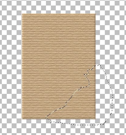
14. If it isn't already, click on your paper layer to make it active. With your freehand selection tool, draw out where you want your tear to be. Here's what mine looks like:

Photobucket

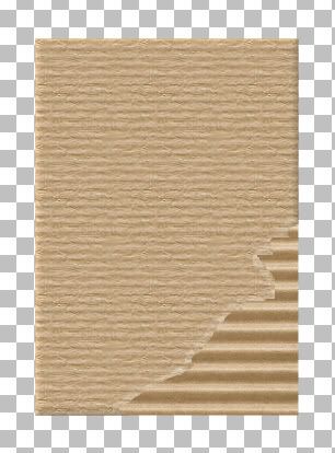
15. Hit the Delete key on your keyboard. That piece we outlined should now be gone.

16. Go up to the Selections tab at the top, down to Modify, then to Expand. I've chosen to expand by 6, you may make your selection larger or smaller.

17. Click on your Lighten/Darken tool on the left. Default round brush, Size is 8, Hardness is 50, Density and Thickness is 100, Opacity is 32. Swipe down and lighten your image that is inside the marching ants selection. You can lower or raise the opacity to lighten more or less, but it looks good to me, so i'm going to keep it like that.

Photobucket

* Next we need a little texture on that section with the marching ants.

18. Go up to the Effects tab, down to Plugins, then find Texture, then Texturizer and use these settings:

Photobucket

19. Go up to the Selections tab and choose Select None.

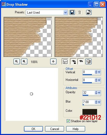
20. I like to put a barely visable drop shadow on this layer so go up to the Effect tab, over to 3D Effects and then to Drop Shadow and use these settings:

Photobucket

21. Get your eraser brush out and click on your layer that has the drop shadow on it. Erase all around the outter edges. We only want the drop shadow under our rip.

22. Basically your done. All you need to do is add an eyelet, erase the middle of it and add a string.

* I only made one large rip at the bottom, if you are doing more than one, ripping it all over in different sections, hold down your shift key each time you make a new rip.

You can also make it more beat up looking by lightening and darkening it in places. Start off with a low opacity of about 9, brush size about 45 to 53, Hardness of 50. Lighten it in places all over, then darken it in places you didn't lighten it. Change the opacity to about 13 and darken some of the edges and other spots on the tag or whatever image you have.

TOU:

If you do this tutorial, your end result is yours to do whatever you wish; give it away as a freebie, use it as part of a kit, or sell it for profit. You may not make this into an action or script to give away as a freebie or to sell for a profit. A mention or a link back here would be appreciated but is not mandatory. Please do not share the supplies or tut through email or any other means, send them here to my blog to get the supplies and tut for themselves.
 
posted by Scrap Stuff by Shawna at 7:45 PM | Permalink | 251 comments
Sunday, June 8, 2008
Wire Words-Requested Tut
Photobucket


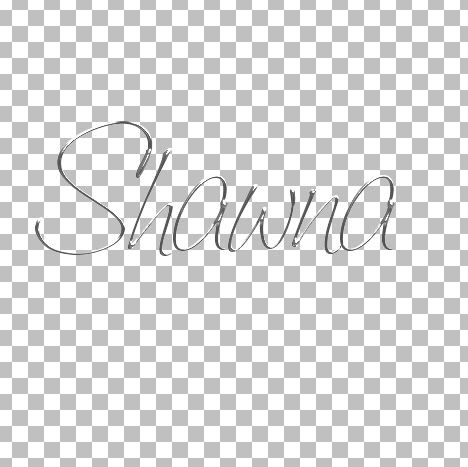
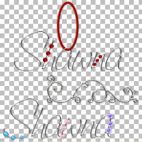
This is a very quick and simple tutorial on how to create wire words or shapes.


Supplies Needed: Super Blade Pro -- download a Trial HERE
My Zip: Fonts, and SK Wire Words Silver SBP setting. Download HERE

* Place the 2 SK Wire Words bitmaps and the .q5q file into your SBP Environments and Textures folder, wherever you have it installed on your computer.


1. Start by opening up a new transparent image. I'm using a size of 475 by 475 pixels for the purpose of this tutorial, but you can choose whatever size you want.

2. Set both foreground and background colours to white.

3. Double click on a font from the zip, or use one of your own choosing. I have chosen to use the Saginaw font. Create as Vector, Size 100, Stroke Width 0, Anti-alias is checked.

* You don't have to install the font, just open it up by clicking on it and then minimize it. You will still be able to use it without installing.

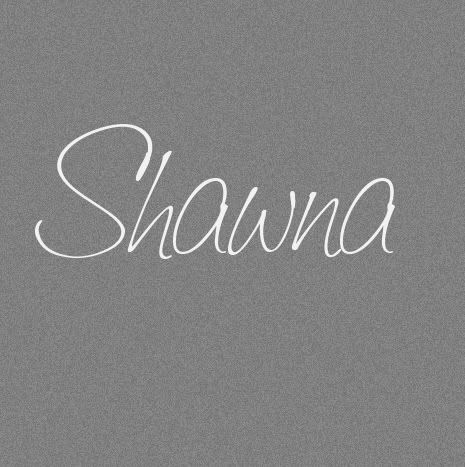
4. Type out your name on your canvas.

Photobucket

5. In the layer palette, right click on Vector 1 and choose Convert to Raster Layer.

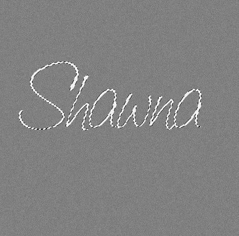
6. Go up to the Selections tab, choose Select All, back up to the Selections tab and choose Float, then again to the Selections tab and choose Defloat.

*You should have marching ants all around your image.

Photobucket

7. Go up to the Effects tab, down to Plugins, find Flaming Pear and choose Super Blade Pro.

8. From the list of presets, find SK Wire Words.q5q, select it and then hit OK. You should have something that looks like this:

Photobucket

9. Go up to the Selections tab and choose Select None.

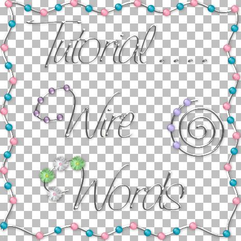
Use tiny beads, flowers or whatever you feel like decorating it with. I've included in the zip, 25 tiny beads to get you started. Put a small drop shadow on your wire words and you're done :)

Photobucket

TOU:

If you do this tutorial, your end result is yours to do whatever you wish; give it away as a freebie, use it as part of a kit, or sell it for profit. You may not make this into an action or script to give away as a freebie or to sell for a profit. A mention or a link back here would be appreciated but is not mandatory. Please do not share the supplies or tut through email or any other means, send them here to my blog to get the supplies and tut for themselves.
 
posted by Scrap Stuff by Shawna at 8:32 AM | Permalink | 141 comments
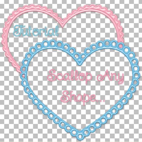
Scallop Any Shape
Photobucket


Needed:

Vector Tube Script which you can download HERE
Zipped Stuff: Heart Shape, scallop dot tube, (scallop dot in png format included). Download HERE

* Unzip the vector tube script and place it in your Scripts-Restricted folder.


1. Start by opening up a 200 by 200 transparent image.

2. Set your foreground and background colours to black.

3. Click on your Preset shapes tool on the left and set it to Ellipse. Anti-alias and Create as Vector are both checked, line style is solid, and a Width of 1.

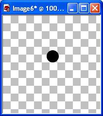
4. Draw out a small circle on your canvas about the same size as the one in the picture below: My circle tube is included in the zip.

Photobucket

5. Crop the extra space away from your circle and export it as a tube. File menu, Export, Picture Tube, leave everything at it's default and just give it a name like small scallop 01.

* You can delete that canvas after tubing it, we no longer need it.

6. Open up a 450 x 450 pixel transparent image.

7. Set your foreground and background colours to a light grey. I'm using #C0C0C0.

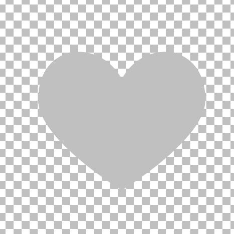
8. Click on your Preset Shapes tool on the left and choose Shawna Heart from the list. Anti-alias and Create as Vector are checked, line style is solid, and a Width of 1.

9. Draw out your shape like in the picture below:

Photobucket

10. Click on your Picture Tube Tool on the left and find your single black dot you made earlier or if you are using mine, find temp scallop circle. Scale is 100, Step is 20, Placement Mode is Continuous, and Selection Mode is Incremental.

* If you have chosen to use your own black scallop dot, you need to increase or decrease the Step number so that your dots are spaced correctly and touch each other. Open an temp canvas and drag out a line of dots. If they are too close together, then decrease the Step number, if they are too far apart increase the step number untill they are placed appropriately.

11. Go up to the Script section in the options bar along the top and scroll down to the bottom and find Vector Tube and select it.

Photobucket

* Your heart shape needs to be a Vector shape, so if you've automatically right clicked and changed it to a raster layer, change it back to a vector from the undo button in the edit tab or redo it.

12. Beside your Vector Tube script there is an arrow pointing to the right, click it once.

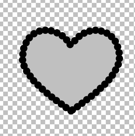
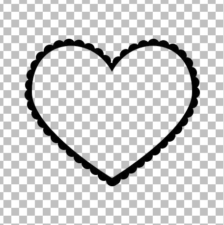
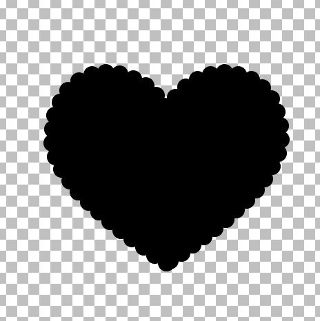
* Your heart should now be scalloped with your black dot tube:

Photobucket

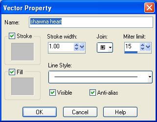
13. In the Layers Palette on the right, click the + sign beside Vector 1. You will see the title shawna heart. Double click that and a vector property box will pop up.

Photobucket

14. Click the light grey coloured box under Stroke, then click on the black coloured square to change your grey to black. Do the same for the Fill properties, then click OK.

* Your entire shape should now be all black:

Photobucket

15. In the layer palette, right click on Vector 1 and choose Convert to Raster Layer.

16. Right click on one of the layers in the layer palette and choose Merge, then Merge Visable.

* At this point, you can save this as a .psp or .png file and use it as a solid template, or if you want to make it a frame with the middle cut out then continue on.

17. Set your foreground and background back to our light grey colour #C0C0C0.

18. Click on your Preset Shapes tool again and find your heart we used earlier, same settings.

19. Draw out another heart shape on top of your black scalloped heart. The size of heart you draw will determine the size of your scalloped border. A smaller heart will leave a larger border and a bigger heart will leave a smaller border when we delete it for the middle. Use the nodes that are on each end of the dotted square to pull the heart in or out. Here's what mine looks like:

Photobucket

* Here's a little trick to get your 2 shapes centered perfectly on top of each other. When you've drawn out the size of heart you want for the middle, click once on your black layer to make it active, go up to the Edit tab and choose Cut, then go back and choose Paste, then Paste as New Layer. It will center perfectly in the middle of your canvas. Then do the same for the grey heart.

20. In the layer palette, right click on your Vector layer and choose Convert to Raster Layer.

21. Go up to the Selections tab at the top, down to Select All, up to the Selections tab again and choose Float, then back up to the Selections tab and choose Defloat.

* You should have marching ants all around your grey heart.

22. Hit your Delete key on your keyboard.

23. In the layer palette, click on your black layer to make it active, then hit the Delete key on your keyboard.

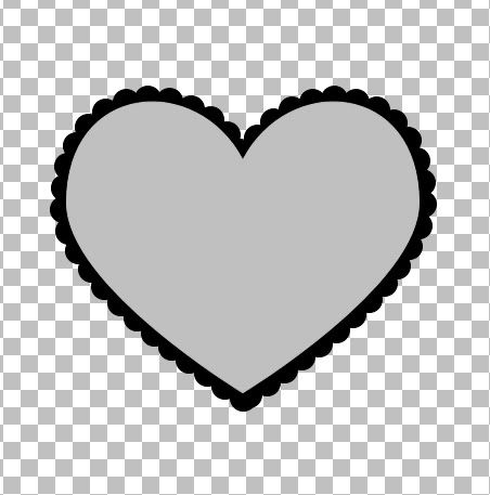
24. Go up to the Selections tab at the top and choose Select None. You should now have this:

Photobucket

25. In the layer palette, delete what was once your grey heart layer. It sometimes still has a small border left from cutting and we don't want that to interfear with our design.

That's it!!! You can now scallop any shape, and size you want, quick and easy.

* Tip: You can also cut tiny shapes out of your single scallop dot like stars, circles, hearts ect..... then use the Vector Tube script to scallop your shape.


TOU:

If you do this tutorial, your end result is yours to do whatever you wish; give it away as a freebie, use it as part of a kit, or sell it for profit. You may not make this into an action or script to give away as a freebie or to sell for a profit. A mention or a link back here would be appreciated but is not mandatory. Please do not share the supplies or tut through email or any other means, send them here to my blog to get the supplies and tut for themselves.
 
posted by Scrap Stuff by Shawna at 8:28 AM | Permalink | 28 comments
Monday, June 2, 2008
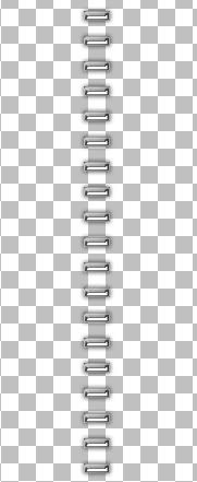
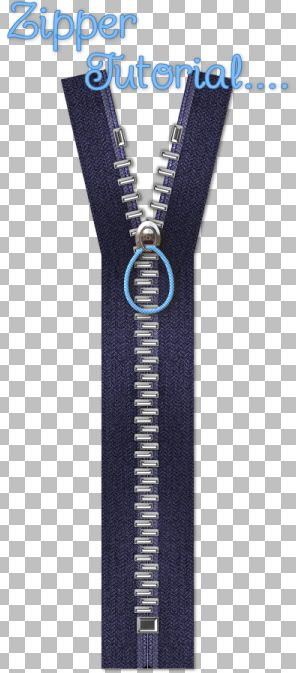
Zipper-Requested Tut
Photobucket


Supplies Needed:

My Supplies: SK Herringbone Dark Blue, SK Silver Top Stop, SK Bottom Stop, SK Pulls, SK Teeth, SK Teeth Lines, Greg's Pool Shadow plugin. Download Here
Mura's Meister Copies: Download Here
Optional: Super Blade Pro Trial

* I cannot include the silver preset that I used becaue it is not mine, and I don't have permission to use it in this tutorial, but just do a google search and you will find hundreds of them.

* I have also included in the zip file a few different zipper teeth, pulls, and stoppers in silver that I made for those that don't have or don't want to install SBP.


There are a few different kinds of teeth that zippers use, but I'm going to show you the easiest rectangle tooth first, then get into the other 2 another time.

1. Open up a 200 by 200 transparent image.

* To get a silver/chrome or gold tone to your zipper teeth, the easiest plugin to use is Super Blade Pro. The link to a trial version is in the Optional section above.

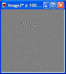
2. Click on your Selection tool on the left and set it to Rectangle, Anti-alias is checked and Feather is 0.

3. Draw out a small rectangle for the first tooth, size appropriate to the size of zipper you want to create.
Photobucket

4. Go up to the Layers tab at the top and choose New Raster Layer.

* If you are not using Super Blade Pro, and just want a coloured tooth, fill with desired colour, give it a slight bevel and skip to step #7.

5. Fill with white. Don't deselect yet.

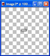
6. Go up to the Effects tab, down to Plugins, over to Flaming Pear, then to Super Blade Pro. Find a silver preset you like and apply it. Here's what mine ended up looking like. I have a slight drop shadow on mine, but because we are using such a dark fabric for this tut, the shadow will not have much of an impact, so you don't have to put one on if you don't want.
Photobucket

7. Open up an 400w by 800h transparent image.

8. Copy and paste your single silver zipper tooth onto your new canvas.

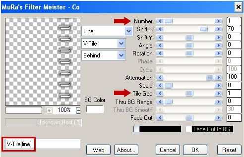
9. Go up to the Effects tab, down to Plugins, then find Mura's Meister and select Copies. Change your settings to the ones in the picture below.

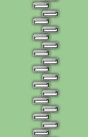
* I first tried a Tile Gap of 2, but when I put my 2 lines of teeth overlapping each other, the space inbetween was to large, so I clicked Undo, went back to Mura's Copies and tried a Tile Gap of 1 and it was perfect. Depending on the size of tooth you made, you may need to adjust yours as well, so that there isn't a noticable amount of space between the right side of the zipper teeth when you put the together.
Photobucket

This is how the spacing should look when we put them together. They should fit snuggly into each other, so adjust your tile gap accordingly.
Photobucket

This is what mine looks like now:

Photobucket

10. Rename this layer Zipper Teeth Left.

11. Open up the SK Herringbone fabric swatch from the zip file and set it as your foreground and background material pattern. Angle 0, Scale 100.

12. Click on your Preset Shapes tool on the left and set it to Rectangle. Anti-alias and Create as Vector are checked, Line Style is Solid, Width is 1.

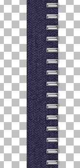
13. Draw out a long rectangle the entire length of your canvas, and a little bit wider than twice the width of your zipper teeth. See pic below for example:
Photobucket

14. In the layer palette on the right, right click on Vector 1 and choose Convert to Raster Layer.

15. Rename that layer Material Left.

* Our fabric kind of looks plain and flat to me so we're gonna give the inside a very slight bevel.

16. Make sure your Material Left is highlighted in the layer palette. Click on your Selection tool on the left and set it to Rectangle, Feather is 0, Anti-alias is checked.

17. Draw out a very small rectangle the entire length of your material left section. Turn off your zipper teeth line so you can see the material layer better. ( click the eye icon beside zipper teeth left in the layer palette) See picture below for example:
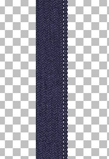
Photobucket

18. Go up to the Effects tab, over to 3D Effects, then to Inner Bevel and use these settings:
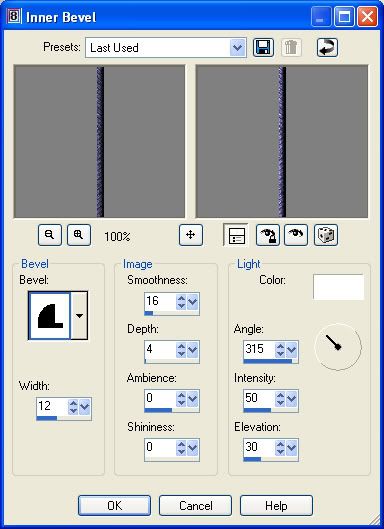
Photobucket

* Don't deselect yet, we are going to do that same bevel again.

19. Repeat the inner bevel one more time, then go up to the Selections tab at the top and choose Select None. You should have what looks like this now:
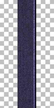
Photobucket

* Now we are going to cut away that small flat part to the right of the bevel.

20. Select your Selection tool, set it to rectangle if it isn't already and draw out a small long rectangle like in the picture below:
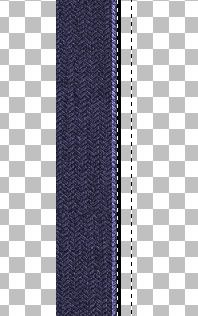
Photobucket

21. Hit your Delete key on your keyboard, then go up to the Selections tab and choose Select None.

* Next we want to make a slightly bigger seam but we aren't going to use the bevel funtion this time, we are just going to lighten it.

22. Click on your Selection tool again, rectangle. Draw out another long rectangle, slightly bigger than the first one we did. Zoom to about 200% and get close to the edge of the first seam, but leave a very small space inbetween the two. The reason being, when we lighten our section here, that very small space we left will still appear dark, and will give the look of a seam separating the two. See the picture below:
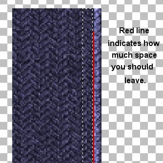
Photobucket

23. Click on your Lighten/Darken tool on the left. Size is 17, Hardness is 50, Step is 5, Density and Thickness is 100, Rotation is 0, and Opacity is 60.

* Since our selection has marching ants around it, you don't have to worry about lightening the wrong part of the material. The marching ants will prevent that. I've found that it is easier to use this tool on a zoomed out, smaller looking canvas because then you can just do one long short stroke and get it very even, rather than doing one stroke then scrolling down and continuing on. So......

24. Click the Pan tool on the left. It looks like and arrow pointing upwards and to the left. Change the number in the Zoom % section up top to about 60%. Then using your Lighten/Darken tool, make one long, continuous stroke all the way down your selection. Keep your mouse cursor inside the marching ants selection.

25. Go up to the Selections tab, choose Select None. This is what yours should look like at this point. See why now you left a tiny space in between our 2 lightened sections? It looks like there is a dark seam there.
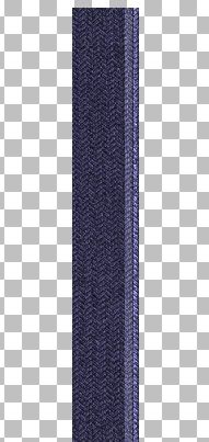
Photobucket

* Our zipper is looking good, but it looks a little flat to me so we're going to give it a bit of shadowing. And, since this is a long tut, I'm gonna do a quicky shortcut for shading and use a plugin.

26. Go up to the Effects tab, down to Plugins, and find Greg's Pool Shadow and use the settings in the picture:
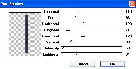
Photobucket

* You should now have some wave and darkening to your left material.

* Next, we are going to give the top a little bit of a V opening, so we need to slant part of our zipper to the left and then make the material match up.

27. Unhide your zipper teeth left layer and click it once to make it the active layer. (click on the eye icon next to it in the layer palette to unhide it).

* There's too many teeth near the top, so we need to get rid of a few of those first.

28. Click on your Selection tool, set it to Rectangle. Draw out a rectangle on the first 4 top teeth and then hit delete on your keyboard.

29. In the Layer Palette, right click on your Material Left layer and choose Duplicate. Then hide Copy of Material Left layer for now.

30. Click on your Material Left layer, and draw out a rectangle from the top, and stopping halfway inbetween the 6th and 7th tooth.
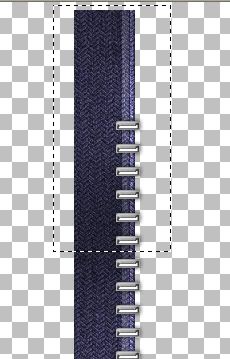
Photobucket

31. Go up to the Edit tab, select Cut, back up to the Edit tab, select Paste as New Layer.

32. Go up to the Selections tab, choose Select None.

33. Right click on your cut section and rename it Left Top Piece.

34. Go up to the Image tab, choose Rotate, then Free Rotate. The green dot is beside the word Left, the green dot is beside the word Free and type in the number 13 in the box. Make sure All Layers and Rotate single layer around canvas center are both unchecked, and hit OK.

* Rotating makes our image slightly fuzzy so we are going to sharpen it with the Unshapr Mask option.

35. Go up to the Adjust tab, choose Sharpness, then choose Unsharp Mask. Radius is 1.00, Strength is 47, and Clipping is 0. Hit OK.

36. Move Top Left Piece over the bottom half of your Material Left and line up the edges evenly like in the picture below:
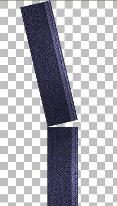
Photobucket

37. In the layer palette, click on Copy of Material Left to make it active but don't unhide it yet.

38. Click on your Selection tool, rectangle again, and make a selection like in the picture below:
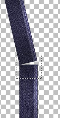
Photobucket

39. Go up to the Selections tab, click on Invert and hit the Delete key on your keyboard.

40. Go up to the Selections tab and choose Select None.

41. Unhide your Copy of Material Left in the layer palette and move it below your Material Left layer.

* Just to make sure, you should have in the layer palette, zipper teeth left, then left top piece, material left, copy of material left on the bottom.

Yours should look like this, with a small piece sticking out. We need to get rid of that.
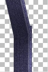
Photobucket

42. Click on your Eraser tool, and with very small short clicks, erase out that corner point, being carefull not to erase too far or you will get a gap.

43. In the layer palette, right click on one of your visable layers ( your teeth layer should be turned off) and choose Merge then Merge Visable, and rename it Left Material.

* Now we need to rotate our teeth to match up with our material.

44. Turn on your teeth layer and click it once to make it active.

45. Click on your selection tool again, rectangle and drag it out over the first 6 teeth to select them.

46. Go up to the Edit tab, choose Cut, back up to the Edit tab, and choose Paste, then Paste as New Layer.

47. Go up to the Selections tab, choose Select None.

* You can move those up a bit to a blank space but don't get too close to the top. We need to rotate these too and we don't want them going off the page.

48. Go up to the Image tab, choose Rotate, then Free Rotate and use the exact same settings we used before. They should still be there when the box pops up so just hit OK.

49. Again, use the same settings for sharpening that we used in step #35, then move those 6 teeth into place like in the picture below. Place the 6th tooth over the bended part to hid any flaws:
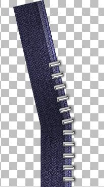
Photobucket

50. If they aren't already, even out your 2 sections of teeth, then turn off your Left Material layer in the layer palette and Merge Visable your 2 teeth layers.

51. Rename that layer Left Teeth.

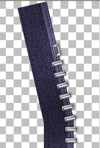
* We still need to make a top stop, a bottom stop and a slider, so let's start on the top stop.

52. It's basically a silver rectangle shape, same as the teeth, only a little fatter. So once again, draw out a small fatter rectangle and use Super Blade Pro on this, or whatever plugin you used to make your teeth.

* I've included a silver top stop in the supply zip.

53. Rotate it so it matches up with our line of teeth and if necessary, use the Unsharp Mask on it as well. Here's what mine looks like now:
Photobucket

54. We need to make room for the bottom stop, so click on your Left Teeth layer, and with your rectangle selection tool make a selection around the bottom 2 teeth and hit Delete on your keyboard to get rid of them.

55. Go up to the Selections tab and choose Select None.

56. Now for our bottom stop. That is just a small silver square. Draw that out about the same size in the picture below, and use SBP or whatever plugin you used.
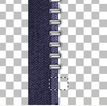
Photobucket

* Ive also included one of these in the zip.

57. Rename that layer Bottom Stop, and place it at the bottom of your zipper.

* Now we need to duplicate our left material and our left teeth layer for the other side.

58. Click on your Left Material layer to make it active. Right click it in the Layer Palette and choose Duplicate.

59. Go up to the Image tab and choose Mirror.

60. Click on your Left Teeth, then right click it and select Duplicate.

61. Go up to the Image tab and choose Mirror.

* You'll need to do a bit of shifting here. Move your Right Material layer over a bit to the right, then line up your teeth so they intersect with the other side of teeth. Here's what mine looks like:
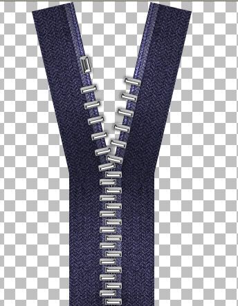
Photobucket

62. In the layer palette, click on your Left Topper to make it active, right click it and choose Duplicate.

63. Go up to the Image tab and choose Mirror and move it into its place.

64. At the bottom of your zipper, move the bottom stop over so it's evenly placed.

65. I've made and included a few zipper pullers in the zip, but feel free to make and use your own. All that's left to do is copy and paste a puller onto your canvas, move it in place and merge visable your layers and you are done :)

Photobucket


TOU:

If you do this tutorial, your end result is yours to do whatever you wish; give it away as a freebie, use it as part of a kit, or sell it for profit. You may not make this into an action or script to give away as a freebie or to sell for a profit. A mention or a link back here would be appreciated but is not mandatory. Please do not share the supplies or tut through email or any other means, send them here to my blog to get the supplies and tut for themselves.
 
posted by Scrap Stuff by Shawna at 6:34 PM | Permalink | 73 comments
Round Scalloped Frame-Requested Tut
Photobucket

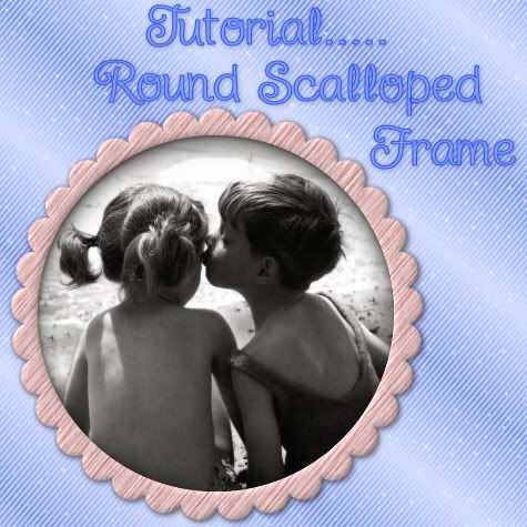
In this tutorial, I'll show you how to make a round scalloped frame with mura's meister copies. I will be doing another tut some time soon to show you how to scallop other shapes such as squares, triangles, or just about any shape you can think of.


Supplies Needed: Mura's Meister Copies plugin Download Here


1. Start by opening up a transparent image slightly bigger than the size you want your scalloped frame to be.

2. Set your Foreground and Background colour to black.

3. Click on your Preset Shapes tool on the left and set it to Ellipse. Anti-alias and Create as Vector are both checked, Line Style is Solid, and Width of 1.

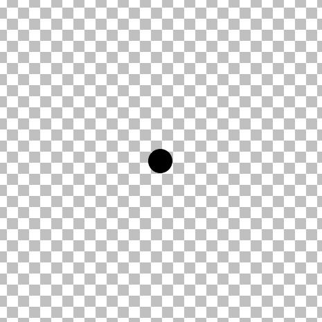
4. Hold down the Shift key and draw out a small circle, the size you want your scallops to be. (Holding down shift keeps the circle from going into an oval shape) Here's what my circle looks like.

Photobucket

5. In the layer palette on the right, right click on Vector 1 and choose Convert to Raster Layer.

6. Now, we need our single circle in the middle of our page for this next plugin to work, so the easiest way to do that is to go up to the Edit tab, choose Cut, then back up to the Edit tab, and choose Paste, then Paste as New Layer.

7. Next, go up to the Effects tab, down to Plugins, find Mura's Meister, and choose Copies.

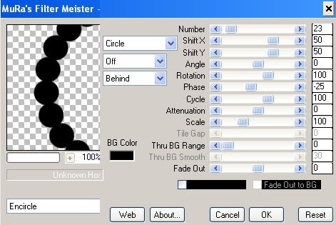
8. At the bottom left, change whatever you have in there to Encircle, then make sure the rest of the settings are the same as in the picture below.

* Depending on the size of circle you made, you will have to adjust the Number section so that your dots line up with each other. My circle may not be the same size as yours, so my number will be different but the rest should remain the same.

Photobucket

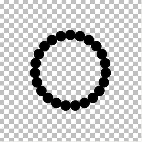
Here is what mine looks like now:

Photobucket

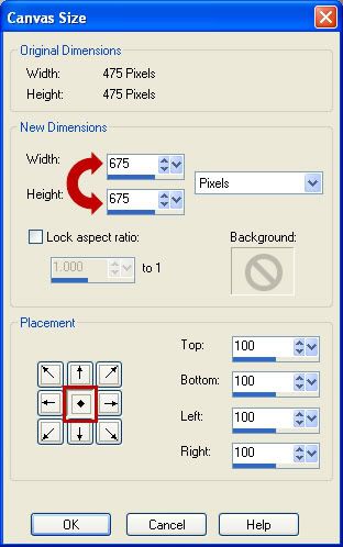
* If your result is smaller than you want it to be, go to the Edit tab and click Undo. You will revert back to your single dot. In order for your frame to increase in size, you need to increas your canvas size. Go up to the Image tab at the top, then down to Canvas Size.

Photobucket

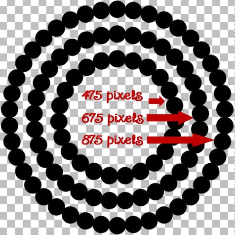
Your original height and width of your canvas is at the top. Try increasing your canvas by a few hundred pixels at a time to get the desired size. You will need to then go back and repeat steps #7 and #8 to redo the circle frame. Don't forget to change the Number section to get your dots to line up properly again.

* The smallest middle section is my original canvas of 475 pixels, the second one is my result after increasing my canvas from 475 to 675, and the third I increased my canvas to 875. You decide how much you want yours to increase.

Photobucket

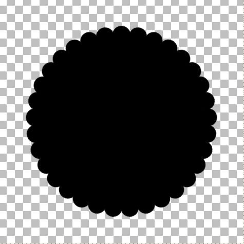
9. Now we need to fill in the middle. Click on your Magic Wand tool on the left. Mode is Replace, Match Mode is RGB, Tolerance is 30, Feather is 0, Anti-alias is checked. With your circle layer active (highlighted blue in the layer palette on the right), click once in the center.

* You will have marching ants all around the bottoms of your circles.

10. Go up to the Selections tab, choose Modify, then Expand. In the Number of Pixels section, type in 5 and hit OK.

11. Go up to the Layers tab, choose New Raster Layer.

12. Flood fill your new layer with black.

13. Go up to the Selections tab and choose Select None.

14. In the Layers Palette on the right, right click on one of the layers and from the flyout choose Merge, then Merge Visable. You should now have this:

Photobucket

15. Change both your Foreground and Background to white.

16. Click on your Preset Shapes tool on the left and choose Ellipse.

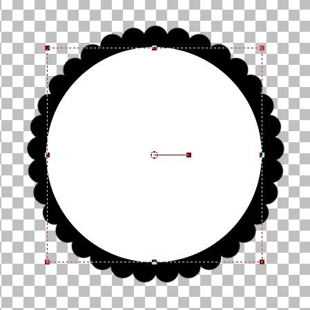
* This next step we are going to draw out a circle that will represent the hole we will cut out for the middle of your frame. Draw it out so that it is smaller than your frame and doesn't cover any of the outter scallops. It must be a perfectly round circle, but the size doesn't have to be exactly the size you want the middle of your frame to be. We will fix that too.

17. Hold down the Shift key and draw out a circle. Here's my example:

Photobucket

18. We need both the black circle template and the white circle to be exactly in the middle of our canvas, so click on the black circle template to activate it, go up to the Edit tab, choose Cut, back up to the Edit tab and choose Paste as New Layer. Do the same to the white circle.

* Now, It looks like I'm going to have too much of a black inner border on my scalloped frame, so I'm gonig to increase the size of my white circle just a bit to make my black border smaller.

* If you like the way yours looks now, just leave it and skip to step 21.

The white circle is a vector shape still, so we can just pull the nodes to increase the circles shape without getting any jagged edges. Click on the Object Selection tool on the left. It looks like a square with an arrow in the middle and it is probably the last tool in your toolbar.

* You will get what looks like a dotted line square with a smaller square at each corner.

19. Now, to keep this circle in perspective while we pull the node to make it bigger, you need to use your Right Click mouse button this time. Put your cursor on the bottom right square, hold down your Right Click mouse button and pull out slightly.

20. We need to center it perfectly again, so go up to the Edit tab, choose Cut, back up to the Edit tab and choose Paste as New Layer.

* You can click the Mover tool button to get rid of that dotted square so you can see how it looks without that being in the way. If you think your black border is still to big, repeat steps 19 and 20.

21. I like mine the way it is, so in the Layers Palette on the right, right click on your White Vector Circle and from the flyout choose Convert to Raster Layer.

22. All that work and now we are going to delete the white circle. Go up to the Selections tab, choose Select All, back up to the Selections tab, choose Float, up to the Selections tab again and choose Defloat.

* You should now have marching ants all around your white circle.

23. Hit the Delete button on your keyboard, and the white circle will disappear.

24. In the Layer Palette on the right, click on your black scallop layer to select it. Now hit the Delete key on your keyboard again.

* Your middle should now be transparent.

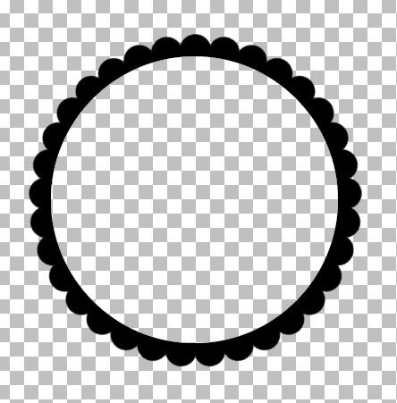
25. Go up to the Selections tab, choose Select None. Here's mine:

Photobucket

* Delete all layers except the black scalloped layer and save this as a .psp file so you can use it as a template again.

*Now all you need to do to colour it is, go up to the Selections tab, choose Select All, Float, then Defloat.
*Create a new layer from the Layers tab.
*Flood fill with whatever you want.... a colour, paper, gradient, pattern.......
*Delete the black template

TOU:

If you do this tutorial, your end result is yours to do whatever you wish; give it away as a freebie, use it as part of a kit, or sell it for profit. You may not make this into an action or script to give away as a freebie or to sell for a profit. A mention or a link back here would be appreciated but is not mandatory. Please do not share the supplies or tut through email or any other means. If you are using this or any of my tutorials for your groups or as part of your own tutorial, please post a link to the tut on my blog and let your members download the supplies from my blog for themselves.
 
posted by Scrap Stuff by Shawna at 6:17 PM | Permalink | 21 comments