Thursday, July 10, 2008
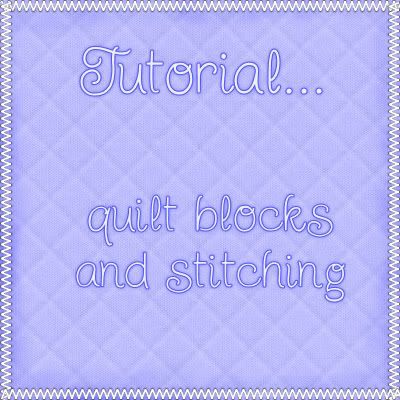
Quilt Blocks and Stitching-Requested Tut
Photobucket


Supplies Needed: Texturizer plugin which you can get HERE
My Supplies: Which you can get HERE


1. Start out by opening up a 400 x 400 transparent image.

2. Open up from my zip, SK Quilting Fabric 01 and set it as your foreground pattern.

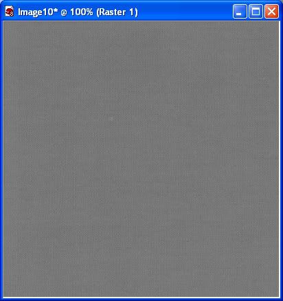
3. Flood fill your canvas with it. You should have what looks like this now:
Photobucket

* This fabric swatch is a bit dark, so we are going to lighten it up a little.

4. In the layer palette on the right, right click on your fabric layer and go to New Adjustment Layer then to Brightness/Contrast. It may also be found under the Adjust tab at the top. Set the brightness up to 35 and click OK.

5. Right click on one of the layers and choose Merge, then Merge Visable.

* Now we are going to change the fabric from grey to another colour.

6. Go up to the Adjust tab at the top, then to Colour Balance, then over to Manual Colour Correction.

* * I'm using PSP8, but in later versions of PSP, the manual colour correction option may be hidden. Go to this site Khiba's, and scroll down to where it says "Custominze! Retrieve Unused PSP 9 Tools" and watch her little viewlet. It will show you how to unhide the maual colour correction option.

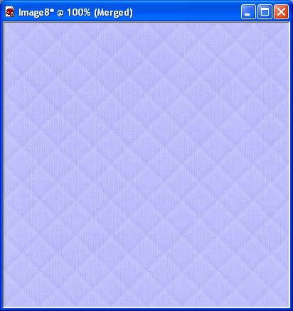
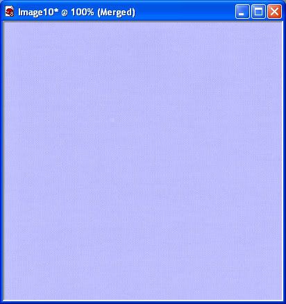
7. Click on the coloured box under Source and from the colour properties box change the colour to #9D9D9D, then click on the coloured box under Target and change it to #C0C0FF then click OK. You should have this:
Photobucket

* Now for the quilting part with the Texturizer plugin.

8. Go up to the Effects tab at the top, down to Plugins, over to Texture, then to Texturizer.

9. Click on the down arrow in the little box beside the word Texture, then click on Load Texture. Navigate to where you unzipped my files and click once on SK Quilt 50 x 50.psd to select it, then hit the Open button and it will appear in your texturizer settings box. Change the other settins to the same as in the picture below:
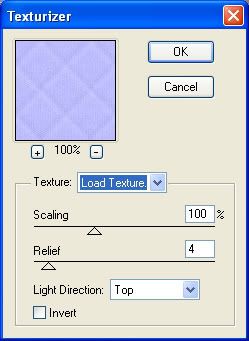
Photobucket

You should now have this:

Photobucket

* I've included several different quilt sizes for the texturizer plugin in the supplies zip for you to experiment with on other projects.

Now for some simple edge stitching......

* I'm not sure if this is a default font or not but just incase, I've included it in the supplies zip.

1. Open up ARDS1 font from the supplies zip and minimize it.

2. Click on your Text tool on the left and go up to the font box at the top and find ARDS1 and select it as your chosen font. Font size is 14, Stroke width is 0, Anti-alias is checked, Line style is Solid, Auto kern is UNchecked, Kerning is -132, Leading is 0.

* We are going to increase our canvas just a little so we can see all the outter edges.

3. Go up to the Image tab at the top, and click on Canvas size. Our canvas we are working on is 400 by 400 and we want to increase it by 50 pixels all around, so starting in the New Dimensions section, change your settings to the ones in the picture below:
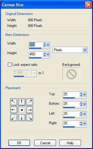
Photobucket

4. Change your foreground and background colours to white.

5. Click once with your cursor at the beginning top corner of your purple quilt layer and your text box will pop up. Hold down the letter v on your keyboard and it will begin to type out a series of v's that are very close together. Let go of the v key when you've reached the opposite edge of of your purple quilt. Click Apply when you are satisfied with what it looks like. Here's mine:
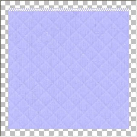
Photobucket

6. In the layer palette on the right, you'll see Vector 1, right click on it and choose Duplicate. We now have 2 identical layers of stitching.

7. Click on Vector 1 to activate it, then click on the + sign in front of it and you will see A vvvvvv as another layer under Vector 1.

8. Right click on the A vvvvv layer and from the flyout choose Convert Text to Curves, then choose As Single Shape.

9. Double click on the vvvvv layer and your Vector Properties box will pop up.

10. Click the white coloured box under Stroke, then change the colour number to #6E5E3E and hit OK.

11. Click on the white coloured box under Fill and change this to #6E5E3E also and hit OK, then click OK on the Vector Properties box.

* Doing this gives our stitches a bit of a thread look rather than having it just very smooth and white. Kinda looks fake that way in my opinion. Now it looks more like stitches and a lot less like v's.

12. In the layer palette, right click on one of the stitches layers and choose Convert to Raster Layer and then do the same for the other stitched layer.
13. Turn off your purple quilted layer by clicking once on the eye icon beside it, and now right click on one of your stitched layers and choose Merge, then choose Merge Visable.

* Now for the pain in the butt part. Putting those tiny black dots under each stitch. I hate doing this and fiddled around and experimented till I found a shortcut, so i'm going to show you my way. If you prefer the other way, create a new layer and place it under your stitch layer. Set your foreground to black and with your paintbrush set at about 4 or so, put a dot under each top and bottom point of your stitches. Merge those two layers when done. Here's my way.

14. In the layer palette, right click on your stitches layer and choose Duplicate. You should have Copy of Merged in the top position in the layer palette.

15. Go up to the Adjust tab at the top, and then all the way down to Negative Image. The copy of your stitches layer should have turned all black.

16. Drag the black stitches layer under your white stitches layer in the layer palette.

17. Set your foreground colour to black or any colour other than white.

18. Click on your Pen tool on the left. Continuous and Create as Vector are both checked, Mode is Drawing Mode, Segment Type is Line Segments, Line Style is Solid, Width is 4, and Anti-alias is checked.

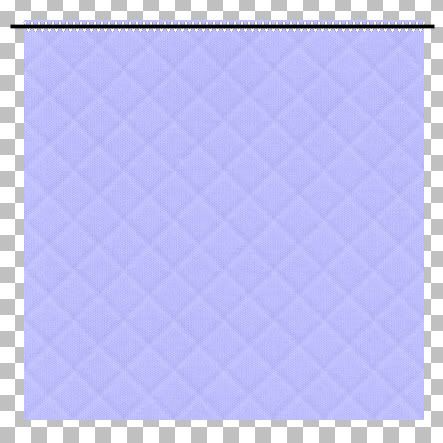
19. Hold down your Shift key and drag out a straight line making sure it extends beyond the edges of your purple quilted layer. See pic below:
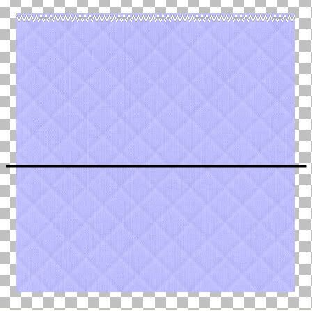
Photobucket

20. In the layer palette, right click on that layer and choose Convert to Raster Layer.

21. Drag that layer above your stitches layer in the layer palette, and then with your Mover tool, position the black line evenly in the middle of your stitches line.
Photobucket

22. Go up to the Selections tab at the top, choose Select All, up to the Selections tab again and choose Float, back up to the Selections tab and choose Defloat. You should have marching ants all round your straight black line.

23. Hit the Delete key on your keyboard.

24. In the layer palette, click on the layer that has the Black stitches on it and hit the Delete key on your keyboard again.

25. Go up to the Selections tab and choose Select None.

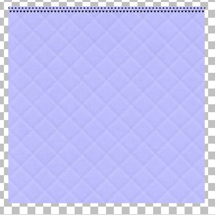
26. You'll notice you have an outline of black left over from the straight black line on your canvas. Right click on that layer in the layer palette and choose Delete.

27. Now, turn off your white stitches layer in the layer palette ( click the eye icon next to it to turn it off) and you will see that you now have what looks like this:
Photobucket

* We need to make the top half and bottom half of these black stitches into 2 seperate layers so that we can move them down a bit to match up with the points in our white stitches so.....

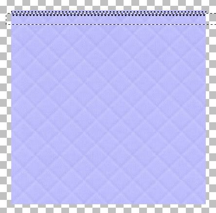
28. On the left, click on the Selection tool and set it to Rectangle. Make sure feather is set to 0 and Mode is Replace.

29. Draw out a rectangle like in the picture below. Careful not to touch the top portion of the black stitches.
Photobucket

30. Click on your black stitch layer to make it active then go up to the Edit tab and choose Cut, then back up to the Edit tab and choose Paste, then Paste as New Layer.

31. Go up to the Selections tab and choose Select None.

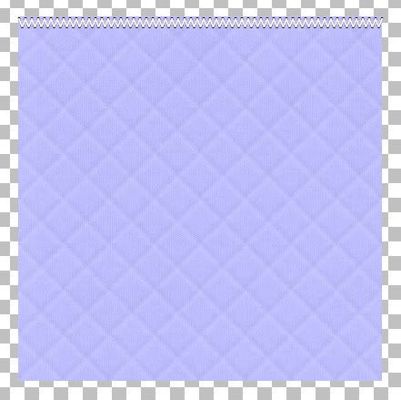
* Now we have 2 black stitch lines that the dots are evenly seperated and will co-ordinate with the spacings in our white stitching layer.

32. Turn on your white stitch layer again, select your Mover tool and move each line of black stitch dots under the white layer and line the black points up with the white points. See picture below:
Photobucket

33. When you've got your placement of black dots lined up with the white, turn off your purple layer and your white stitch layer and right click on one of the black dot layers and choose Merge, then Merge Visable.

* Now, those dots look a little harsh so we are going to give them a slight blur to soften them up.

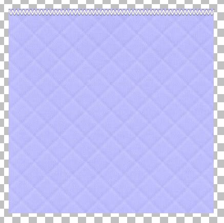
34. With your black dot layer active, go up to the Adjust tab at the top, then down to Blur, then over to Gaussian Blur. In the Radius section, type in 0.75 and hit OK.

* If you like it that way, leave it as is, I lowered my opacity to about 66 on the black blur layer. Just a personal preference. Here's what mine looks like now:
Photobucket

35. When satisfied with what it looks like, turn off your purple layer and right click on one of the remaining layers and choose Merge, then Merge Visable. Rename this layer TOP.

36. In the layer palette, right click on TOP and choose Duplicate, then go up to the Image tab and choose Flip. Rename this layer BOTTOM.

* You may need to adjust that stitched line slightly.

37. In the layer palette, right click on TOP and choose Duplicate again.

* A duplicate layer will appear over your top stitched line.

38. With your Mover tool, drag that new layer down to the middle of your purple quilted layer, then go up to the Image tab at the top, choose Rotate, then choose Free Rotate. Put the green dot beside Right and the green dot beside Free and type in 90.00. Make sure All Layers and Rotate single layer around canvas center are both UNchecked. Hit OK. Rename this layer LEFT.

39. Move LEFT layer over to the left of your purple quilt edge.

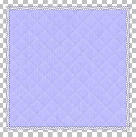
40. In the layer palette, right click LEFT and choose Duplicate. Move that over to the right of your purple edge. Here's what mine looks like so far:
Photobucket

* You'll notice that you have one or two stitches that are hanging over the edges. Just grab your eraser tool and click on the layer that has the hang over and gently erase.

* This is up to your personal preference, but I like to give my stitches a slight drop shadow.

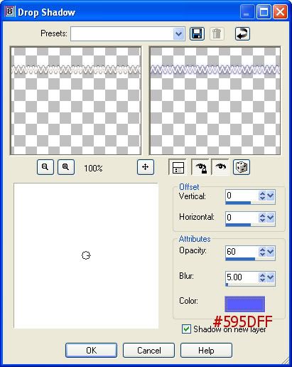
41. Click on TOP in the layer palette to make it active. Go up to Effects, over to 3D Effect, and over to Drop Shadow. I've chosen a darker shade of my purple quilt layer as the shadow colour instead of black so that it doens't darken my stitches. Also, I always put my shadow on a new layer just incase I decide I don't like it or want to change it later on.
Photobucket

42. Click on each of the remaining stitched layers and give it the same shadow.
* Now we are going to darken the edges of our purple quilt layer.

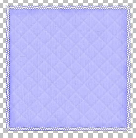
43. Click on your Lighten/Darken tool on the left. Size about 35 to 40, Hardness is 50, Step 25, Density and Thickness is 100, Rotation is 0, Opacity is 20 and also put a checkmark in Swap mouse buttons. That way you can just use your regular mouse button to darken instead of using the right click mouse button because that can get awkward.

* I've just used a few strokes all around the edges to darken them up a bit. Lower the opacity if you think it's too dark. Here's what mine turned out like:
Photobucket

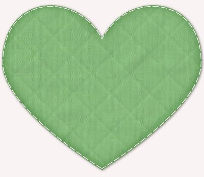
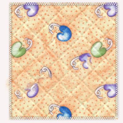
* All that's left to do is Merge Visable and you've got a quilted pattern. This stitching technique also works with x's or the letter l. You can use this quilting technique with shapes as well, and patterned paper too, but you will have to tweak the settings a bit during the Texturize part to get the quilting to show up against the pattern. Experiment and see what you can come up with.
Photobucket

Photobucket


TOU:

If you do this tutorial, your end result is yours to do whatever you wish; give it away as a freebie, use it as part of a kit, or sell it for profit. You may not make this into an action or script to give away as a freebie or to sell for a profit. A mention or a link back here would be appreciated but is not mandatory. Please do not share the supplies or tut through email or any other means, send them here to my blog to get the supplies and tut for themselves.
 
posted by Scrap Stuff by Shawna at 11:57 PM | Permalink | 83 comments
Wednesday, July 2, 2008
Notebook Paper
Photobucket


Supplies Needed:
Mura's Meister Copies (optional): Download Here
My zip containing SK Blue lines and SK Pink Line: Download Here


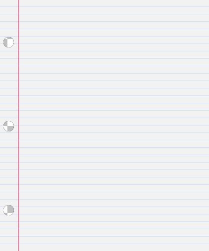
1. Start by opening up a transparent image whatever size you want your paper to be. I'm using a small size for this tut 425 x 510.

2. Set your foreground colour to #F2F2F2 and flood fill your canvas with this.

3. Open up SK Blue Lines from the zip and set it as your foreground pattern. Angle 0 and Scale 100.

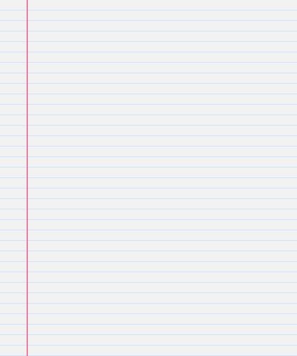
4. Flood fill your canvas with the blue lines. This is what you should have at this point:

Photobucket

5. Open up SK Pink Line from the zip. Copy and paste it onto your canvas.

* You may need to copy and paste it twice if you are making a larger sheet.

6. Move it over to the left leaving a bit of space inbetween the edge and your pink line. Here's mine:

Photobucket

* Next we are going to create the holes for the paper. The use of Mura Meister Copies plugin is optional here. You can do this manually, but I like that it gives you perfect, evenly spaced holes this way. For this to work out properly, we need our canvas width to be the exact same as our height. My canvas height is 510 pixels so we need to increase our canvas size. So.....

7. Go up to the Image tab at the top and click on Canvas Size. In the New Canvas Size box, type in 510 for both the width and height ( make sure it says pixels in the box beside width and height) and hit OK.

* You will have blank space on both the left and right of your canvas.

8. Set both your foreground and background colours to black.

9. Click on your Preset Shapes tool on the left and set it to Ellipse. Anti-Alias and Create as Vector both checked, Line Style is solid, Width is 1.

10. Draw out on your canvas a small circle the size you want the holes to be.

* Now we need this dot to be perfectly centerd on our canvas to use this next plugin properly, so....

11. Go up to the Edit tab and select Cut, then back up to the Edit tab and choose Paste, then Paste as New Layer. It should now be in the center of your paper.

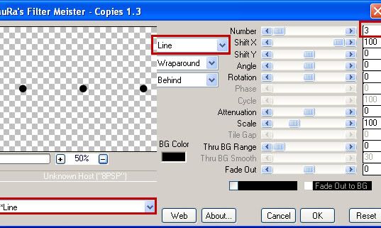
12. Go up to the Effects tab, down to Plugins, then find Mura's Meister and choose Copies. Change your settings to the one's in the picture:

Photobucket

* I only want 3 holes at the side of my paper, if you wanted 4 or more, change the section at the top right that says Number from 3 to however many holes you wanted.

* You should now have 3 holes going in a horozontal direction across your paper. We need to rotate these so that they are vertical.

13. Go up to the Image tab at the top, then down to Rotate, then Free Rotate. The green dot should be in Right, and also beside the word Free. Type in 90.00 amount box. Make sure that All layers and Rotate single layer around canvas center are NOT checked off. Hit OK.

*Your 3 black dots should now be in a vertical line.

14. With your Mover tool, move them over to the left and position them on your paper where you want the holes to be cut out.

Photobucket

15. Go up to the Selections tab at the top, choose Select All, then up to the Selectios tab again, choose Float, back up to the Selections tab and choose Defloat.

* You should have marching ants all around your 3 dots.

16. Hit the Delete key on your keyboard, then in the layer palette, click on the layer that has your paper on it and hit your Delete key on your keyboard again.

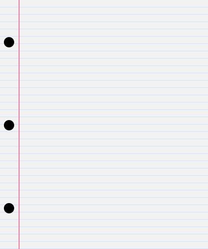
17. Go up to the Selections tab at the top and choose Select None. Here's mine so far:

Photobucket

* You'll notice you have a fuzzy black outline around your holes. That's the slight remains from our cut holes, and we need to get rid of those.

18. In the layer palette, click on your top layer (which was your black dots before we deleted them) and click the delete button or right click on the layer and choose delete.

19. Right click on one of the layers in the layer palette and choose Merge then Merge Visable.

Photobucket

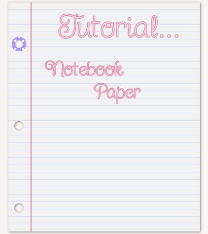
You can spiff up your paper by making some of those thingamajiggs that you stuck over the holes when the paper used to rip out of your binder, or rip a corner off, stain it ect.....

TOU:

If you do this tutorial, your end result is yours to do whatever you wish; give it away as a freebie, use it as part of a kit, or sell it for profit. You may not make this into an action or script to give away as a freebie or to sell for a profit. A mention or a link back here would be appreciated but is not mandatory. Please do not share the supplies or tut through email or any other means, send them here to my blog to get the supplies and tut for themselves.
 
posted by Scrap Stuff by Shawna at 11:23 AM | Permalink | 14 comments
Perforated Edges-Requested Tut
Photobucket


Edit: If your white rectangle kept disappearing when you hit the delete key, i had forgotten to tell you to convert it to raster layer after you dragged it out onto your canvas. I've fixed my mistake and i hope that's the only one. If you have any problems, just let me know.


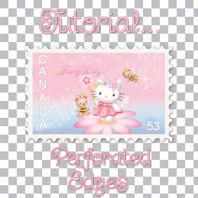
This tutorial will show you how to create perforated edges like the ones found on stamps.

Supplies Needed:

Mura's Meister Copies: Download Here

1. Start by opening up a transparent image about 400 x 400.

2. Set your foreground and background to white or what I'm using is an almost white colour #F6F4F4.

3. Click on your Preset Shapes tool on the left and set it to rectangle.

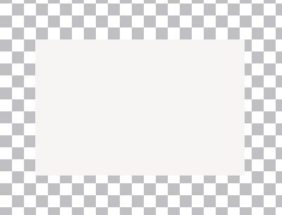
4. Drag out a rectangle onto your canvas. Here's mine:

Photobucket

5. In the layer palette on the right, right click on your rectangle layer and choose Convert to Raster Layer.

6. Set your foreground and background to black.

7. Click on your Preset Shapes tool again and set it to Ellipse. Anti-alias and Create as Vector both are checked, Line Style is solid, Width is 1.

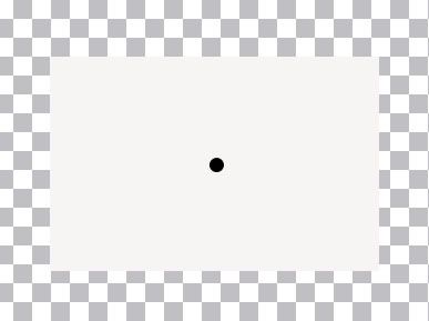
8. Draw out a tiny circle onto your canvas. Here's the size of mine:

Photobucket

9. In the layer palette, right click on that layer and choose Convert to Raster Layer.

* We need this to be centered on our canvas, so...

9. Go up to the Edit tab and choose Cut, back up to the Edit tab and choose Paste, then Paste as a New Layer.

10. Click on the Effects tab at the top, go down to Plugins, find Mura's Meister and select Copies.

11. Click on the Reset button in the bottom right corner, then in the bottom left corner, click the dropdown arrow and find Line and select it.

12. At the top where it says Number, change that to about 23. Yours may vary depending on the size of space you want to leave between each perforation. Click OK.

* You should now have a line of dots going straight across your canvas.

13. I've trimmed my line to 16 dots. Use your eraser tool to get rid of the unwanted dots. ( This next part is optional and just my personal preference) I like to have a bit of space left at the end of each dot just because I think it looks better if the corners aren't cut off. If after trimming your line you don't have any space, use your undo option untill you get back to your single dot and redo the Mura's Meister copies and change the number from 23 to one or two higer to get the dots closer together. See picture under Step #14.

14. With your mover tool, move the line of dots up to rest along the top of the white rectangle. Line up the middle of the of the dots with the bottom half of the dots resting on the white layer. See picture below:

Photobucket

15. In the layer palette, right click on your line of dots and choose Duplicate.

16. With your Mover tool, move that line to the bottom of the white rectangle and line it up with the top layer of dots.

17. Right click on your original line of dots and choose Duplicate. Hide that layer by clicking on the eye icon beside it.

18. Hide your white rectangle layer as well by clicking the eye icon beside it.

19. Right click on one of the 2 black dot lines and choose Merge then Merge Visable.

20. Unhide the white rectangle layer now.

21. Click on your black dot layer to make it active.

22. Go up to the Selections tab at the top, choose Select All, up to the Selection tab again and choose Float, then back up to the Selection tab and chosse Defloat.

23. Hit the Delete key on your keyboard.

24. Click on the white rectangle layer to make it active and hit Delete on your keyboard again.

25. Go up to the Selections tab and choose Select None.

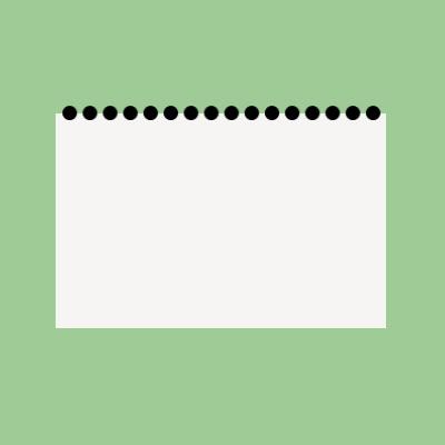
26. In the layer palette, find the layer that had the black dots on them before we deleted it, right click and choose Delete to get rid of the black outline of circles that appears on your canvas. This is what mine looks like now. I've added a green background only so you can see my canvas better:

Photobucket

27. Unhide the remaining layer of black dots.

28. With your Mover tool, move the line down to somewhere near the middle of your canvas.

29. Click on the Image tab at the top, choose Rotate, then Free Rotate. Put the green dot beside Right and beside the word Free, and change the number in the box to 90.00 and click OK.

* You should now have a vertical line of dots.

30. Once again, I've erased a few dots until I ended up with just 10.

31. Move that line of dots over to the right and line it up.

Photobucket

32. In the layer palette, right click on your line of dots and choose Duplicate and move that line over to the left and line that one up as well.

33. Turn off all layers except the 2 remaining black dot lines and then right click on one of them and choose Merge then Merge Visable.

34. Turn your white rectangle layer back on.

35. With your black dot layer active, go up to the Selections tab at the top, choose Select All, up to the Selection tab again and choose Float, then back up to the Selection tab and chosse Defloat.

36. Hit the Delete key on your keyboard.

37. Click on your white rectangle layer to make it active, and hit the Delete key on your keyboard once again.

38. Click on your Selection tab and choose Select None.

39. Delete the layer that has the leftover outline of black dots. Here's what mine looks like now:

Photobucket

40. At this point all you have to do is add a scaled down photo and maybe a drop shadow if you want. Here's my final product:

Photobucket

TOU:

If you do this tutorial, your end result is yours to do whatever you wish; give it away as a freebie, use it as part of a kit, or sell it for profit. You may not make this into an action or script to give away as a freebie or to sell for a profit. A mention or a link back here would be appreciated but is not mandatory. Please do not share the supplies or tut through email or any other means, send them here to my blog to get the supplies and tut for themselves.
 
posted by Scrap Stuff by Shawna at 11:17 AM | Permalink | 17 comments
Felt-Suede Textured Shapes-Requested Tut
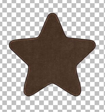
Photobucket


Supplies Needed:

My zip includes 2 textures and star shape, all of which you can download HERE


1. Start by opening a new transparent image about 400 x 400.

2. Open up one of the textures from the zip. I'm going to be using the brown one for this tut.

3. Set your foreground and background pattern to the texture you've chosen. Angle 0 and Scale 100.

4. Click on your preset shapes tool on the left and set it to the rounded star that was included in the zip. Anti-alias and Create as Vector are both checked, Line Style is solid, Width is 1.

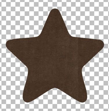
5. Hold down your Shift key to keep the star proportioned and drag out your shape onto your canvas. You'll notice on the right side that it's a little darker. That's because this swatch isn't seamless. I would have made it seamless, but I didn't like the end result, but don't worry, we will fix that up a bit later on.

Photobucket

6. In the layer palette on the right, right click on Vector 1 and from the flyout choose Duplicate.

* You should now have Copy of Vector 1 in the top position in the layer palette.

7. Click on your Eyedropper from the toolbar on the left, then click once somewhere on your brown star to set that colour as your foreground colour. Then Right Click somewhere on your brown star to set it as your background colour. We will be switching from our pattern to use a colour in a minute.

8. In the layer palette on the right, click once on your original star shape, it should be still named Vector 1. Click the small + sign in front of it.

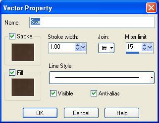
9. Double click on the name of the shape that appears under Vector 1 (in our case Star) and your properties box will pop up.

Photobucket

10. Click once on the brown swatch under the word Stroke and your material palette will pop up.

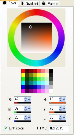
11. Click on the Colour tab at the top and your brown colour you chose from your star with the eyedropper tool should be there. We need to make it a few shades darker so with your mouse, click once a little bit above the circle that you see in the colour palette. My colour turned out to be #2F2019. Click OK when done.

Photobucket

12. Back in your Vector Properties box now, change the Stroke to 7.

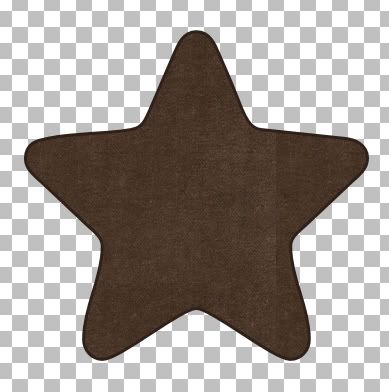
13. Click on the brown swatch under the Fill, and change that colour to the same colour you chose for the Stroke above. Again, mine was #2F2019 and click OK. This is what you should have now:

Photobucket

14. In the layer palette, right click on Vector 1 and from the flyout choose Convert to Raster Layer.

15. Do the same for Copy of Vector 1.

* Now to get rid of that darker right side.

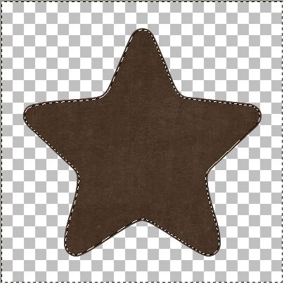
16. In the layer palette on the right, click on Copy of Vector 1 to make it our active layer. Go up to the Selections tab, choose Select All, back up to the Selections tab and choose Float, then back up to the Selectios tab and choose Defloat.

* You should have marching ants all around your star image.

17. On the left, click on your Clone tool. Set the size to about 30 and opacity to 100. Right click once near the middle of your star then move over to the right side and with a few clicks, clone over that dark line a bit.

18. Selections tab again, choose Modify, then choose Contract and type in the number 2 for the Number of Pixels section and hit OK.

19. Go back to the Selections tab and choose Invert. This is what yours should look like (Ive turned off my darker bottom layer for you too see it better)

Photobucket

20. Turn off your darker bottom layer by clicking the eye icon next to it.

21. Choose your Lighten/Darken tool on the left. Default round brush, Size is 12, Hardness is 50, Step 25, Density and Thickness is 100, Opacity is about 53, and Mode is Lightness.

22. Lighten all around that 2 pixel outline of our star. Try and use long even strokes because if you go over the same spot more than once, it will lighten considerably more than you want it too.

* When you think you've got it, turn your darker star layer back on and see what it looks like. Here's what mine ended up looking like:

Photobucket


* Because this brown is such a dark colour, this won't make much of a difference on it, but if you are using a lighter colour, try putting a tiny drop shadow under your top layer to give it a bit more definition. All's left to do is merge visable your layers and you're done :)

Photobucket

Go HERE to learn how to put stitches onto your shape.

TOU:

If you do this tutorial, your end result is yours to do whatever you wish; give it away as a freebie, use it as part of a kit, or sell it for profit. You may not make this into an action or script to give away as a freebie or to sell for a profit. A mention or a link back here would be appreciated but is not mandatory. Please do not share the supplies or tut through email or any other means, send them here to my blog to get the supplies and tut for themselves.
 
posted by Scrap Stuff by Shawna at 11:10 AM | Permalink | 12 comments
Stitching Into a Shape
Photobucket


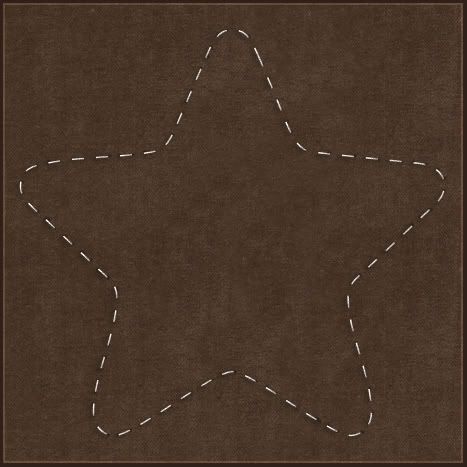
Stitching Into A Shape:

Supplies: Star shape if you don't have it Download Here


* This tutorial will show you two things: how to shape your stitches into pretty much any design you want, and how to make styled lines for your stitches. First off, styled lines.

* You can use styled lines with the pen tool, preset shapes or text. I had wanted to do some stitching around a star shape I made and really had never shaped my stitches before. I normally have just used a straight line when putting stitching on ribbons n such, so I'd never really given it much thought on how to get them to go around a particular shape. I googled forever and got nowhere, the old fart Jeeves had no clue either, so after my frustrating search, and a few hours of poking around psp, I finally figured it out. And, i felt a little silly that it took me that long to do it lol. Anyway, it's done with styled lines. I thought the dashed line that comes with psp didn't look right, they were to short and close together, so back to google and trying to figure out how to make my own. It's pretty simple and I'll give you the basics.

1. Open up a new canvas about 500 by 500 pixles, and flood fill with a dark shade. I'm using #523D2E. That's just so we can see our stitches better.

2. Set your foreground to white and turn off your background. ( click the circle with the line going through it that is under your background materials palette to turn it off)

* Actually, I don't use white, I use #EFEFEF. I find the white is too harsh, but you can use either.

3. Click on your Preset Shapes tool and choose a shape. I'm using a star and have included it in the zip if you'd like to use the same shape. Anti-alias and Create as Vector are both checked, and Line Width about 1.50.

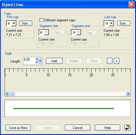
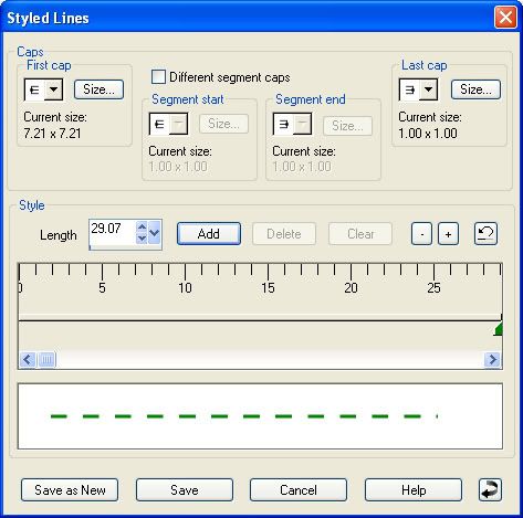
4. In the Line Style box at the top, click on Solid, then go back up to the Line Style box and in the bottom right corner, click on Custom. This is probably what you should see. I'm using PSP8 so yours may look slightly different.

Photobucket

* We are going to edit this solid line into dashes for stitches.

5. Click once on the Add button. You will notice that your solid line in the preview window has changed to a dashed line.

Photobucket

6. Now we are going to change the spacing in bewtween each dash. This takes a little bit of experimentation depending on what you want, but start out by typing in the number 12 in the box beside the Add button.

7. Click the Save As New button (always click save as new so that you don't destroy the solid line that we are editing).

8. Give your new line a name and click OK. It's helpful if the name you give to your line has the Length you chose in it so you will remember what it was if you are unsatisfied with it and want to modify it. I've named mine SK Dashed 12.

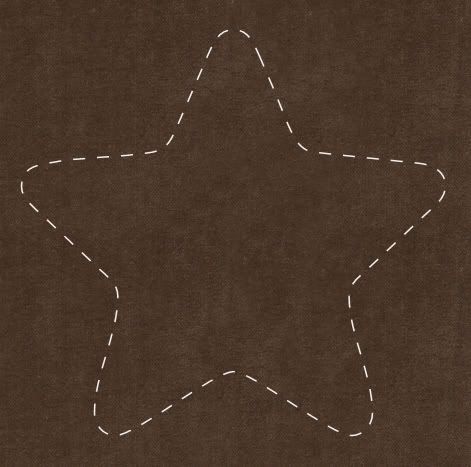
9. Your line is automatically selected as the Line Style, so with your star shape selected as your preset shape, hold down your shift key and drag out your shape. This is what mine looks like:

Photobucket

10. Right click on Vector 1 and choose Convert to Raster Layer.

* It looks ok, but it would look better with some texture, bevel and shadows.

11. Next give it a bit of texture by adding noise. Go up to the Adjust tab, then over to Add Noise. Put the green dot in Uniform, 45 for the amount and Monochrome is checked.

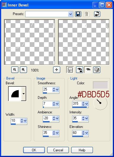
12. With your stitches layer selected in the layer palette, go up to the Effects tab, over to 3D Effects and choose Inner Bevel and use these settings:

Photobucket

* This next step is a bit tedious but neccessary if you want your stitches to look as real as possible. We're going to put little black shadow dots under the ends of each stitch. Your settings will vary depending on what colour background this is going to be placed on once you're done. Since this is a dark background, we need to use a darker colour so it will show up on the paper. If you were using a light background you would use a shade of grey instead of black.

13. Make a new layer and drag it under your stitches layer.

14. Set your forground colour to #221D12.

15. Click on your Paint Brush tool and choose the default round, size about 4, hardness 50, Density and Thickness is 100, Opacity about 70.

16. Start at the top and place a black dot under the ends of each stitch.

* Don't let them stick out too far from your stitch or it won't look realistic. Since we are on a new layer, you can always erase a bit if you make a mistake. Here's what mine turned out to look like so far:

Photobucket

17. Merge visable those 2 layers when satisfied. (turn off your background layer and right click on one of the remaining layers and choose Merge, then Merge Visable).

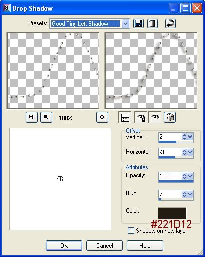
18. Play with your drop shadow settings too see what looks good against whatever background paper you've chosen. Here's my settings for this one:

Photobucket


TOU:

If you do this tutorial, your end result is yours to do whatever you wish; give it away as a freebie, use it as part of a kit, or sell it for profit. You may not make this into an action or script to give away as a freebie or to sell for a profit. A mention or a link back here would be appreciated but is not mandatory. Please do not share the supplies or tut through email or any other means, send them here to my blog to get the supplies and tut for themselves.
 
posted by Scrap Stuff by Shawna at 11:03 AM | Permalink | 18 comments
Foam Stickers
Photobucket


No supplies needed for this tut.


1. Start by opening up a 400 x 400 transparent image.

2. Set your foreground colour to #FFA1AA and your background to #FFBBC2.

3. Click on your Preset shapes tool on the left and set it to the flower from the zip. Anti-alias and Create as Vector are both checked, Line Style is solid and a Width of 1.

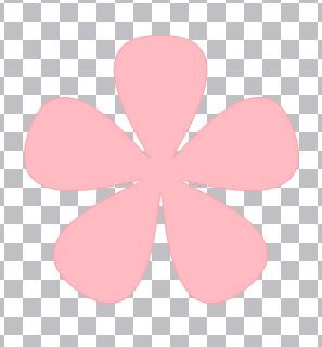
4. Hold down your Shift key and drag out your shape onto your canvas. This is what you'll see:

Photobucket

* The 1 pixel outline will be barely visable, but don't increase it.

5. In the layer palette on the right, right click on Vector 1 and choose Duplicate.

* You should now have Copy of Vector 1 in the top position in the layer palette.

6. Click on the + sign in front of Vector 1, then double click on the name of your shape ( in this case Flower) and your properties box will pop up.

7. Click on the pink swatch under Stroke and change your foreground colour to #EFEFEF, then change the Stroke to 14.

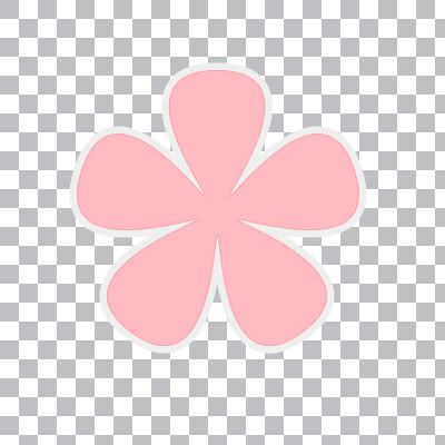
8. Click on the pink swatch under Fill and change the colour to #EFEFEF and click OK. This is what you should have so far:

Photobucket

9. In the layer palette, right click on Vector 1 and choose Convert to Raster Layer, then do the same for Copy of Vector 1.

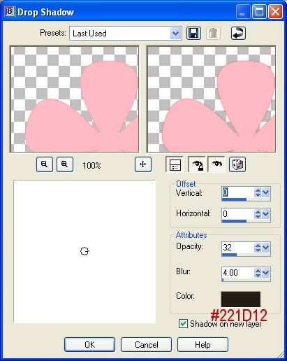
10. Click on your top pink layer to make it active. Then go up to the Effects tab, over to 3D Effects, then to Drop Shadow. Use these settings:

Photobucket

11. Right click on one of the layers in the layer palette and choose Merge Visable.

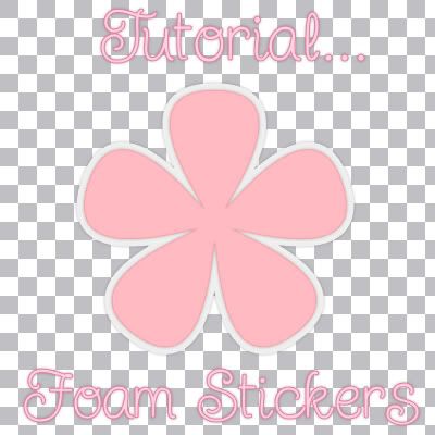
And you're done your foam sticker :)

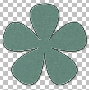
Photobucket

TOU:

If you do this tutorial, your end result is yours to do whatever you wish; give it away as a freebie, use it as part of a kit, or sell it for profit. You may not make this into an action or script to give away as a freebie or to sell for a profit. A mention or a link back here would be appreciated but is not mandatory. Please do not share the supplies or tut through email or any other means, send them here to my blog to get the supplies and tut for themselves.
 
posted by Scrap Stuff by Shawna at 10:59 AM | Permalink | 14 comments