Thursday, March 13, 2008
Smooth Brad
Creating a Smooth Brad


This tutorial on creating a brad uses no outside plugins, just Paint Shop Pro. The second part of this tutorial is creating the outter ring, and that requires EyeCandy 5 Impact.

Photobucket


Supplies May Be Needed:

** I'm pretty sure that the first 2 are included with PSP as a preset already, but if you don't have it, it is in the zip file Here

Preset_BallsandBubbles_Goldball.PspScript: which goes into your presets folder. (mine is located in my documents/my psp8 files/my presets.)

Gold.jpg: which goes into the environment maps folder. (mine is located in my documents/my psp8 files/my environment maps.

SK Smooth Brad.f1s: Which goes into your Bevel folder of the main alien skin folder. This is optional and only used for the second part of the tut if you are using EyeCandy 5 Impact to create the outter circle.

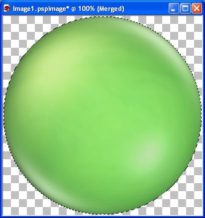
*I'm going to be using the colour green for this tutorial, but don't worry if you don't like it. We are just using it for a template. You'll see what I mean later on.

1. Open up a 300 x 300 new transparent image. Your brad will pretty much fill up the entire canvas, so if you want one that is bigger or smaller, open up an image appropriate for the size you will need. I think it's best to use all the same settings I am using for this tutorial the first time you do it so that there are no inconsistencies.
2. Go up to the Effects tab, then to Artistic Effects, then to Balls and Bubbles. In the preview drop down box at the top, choose the preset called gold ball.
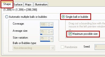
3. On the Shape tab, put your settings like in the picture below.

Photobucket

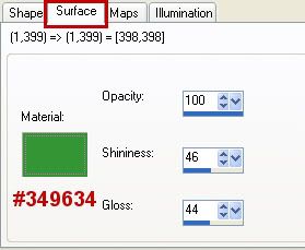
4. Switch over to the Surface tab, change the colour to #349634, and make sure the other settings are the same as the picture below.

Photobucket

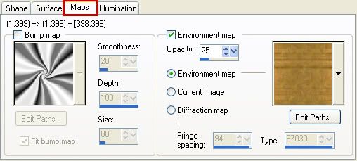
5. On the Maps tab, use the same settins as in the picture below.

Photobucket

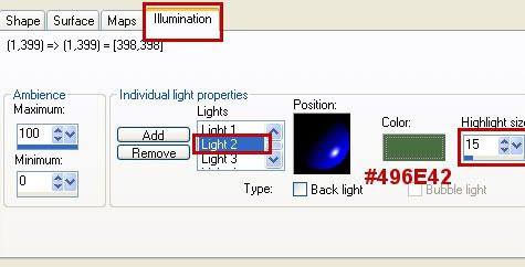
6. On the Illumination tab, click on Light 2 and change the colour to #496E42 and again, make sure the other numbers are the same as the picture below.

Photobucket


* You can save this as a preset if you want by clicking the little icon at the top that looks like a square floppy disk.

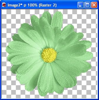
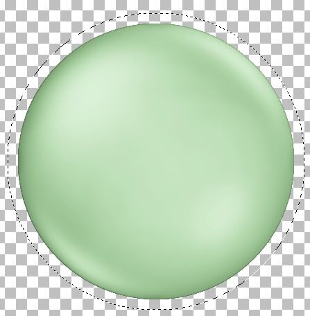
7. Now hit the OK button and you should have what looks like this....

Photobucket


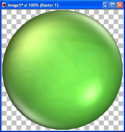
*It doesn't look that great right now as it is, but we're going to fix that by smoothing it out and making the lighting less harsh.

8. Go up to the Selections tab, click on Select All, go to the Selections tab again, click on float, back up to the Selections tab and click on Defloat.

* Do not deselect the layer untill I tell you to do so.

9. Go to the Layer tab and create a new raster layer.
10. Change your foreground colour to this light green #A0CA98, and flood fill your new layer, then move the Opacity slider down to 25.
11. Right click on one of the layers and choose Merge, then Merge Visable. Yours should look like the picture below.

Photobucket

12. Go up to the Layers tab and choose New Raster Layer.
13. You should still have #A0CA98 set as your foreground colour, if it isn't change it back to this.
14. Activate your Airbrush tool and use these settings:

Brush is the Default Round (should be the very first brush in the list)
Brush size is 147
Hardness is 5
Step is 1
Density is 100
Thickness is 100
Rotation is 0
Opacity is 45
Blend Mode is Normal

15. Hold your cursor in the centre of the white highlight in the bottom right corner and click once with your airbrush. The white should appear to be a very light grey now. See picture below.

Photobucket

16. Right click on one of the layers in the layer palette and choose Merge then Merge Visable.
17. Right click on the new merged layer and from the flyout choose Duplicate.
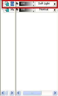
18. In the Blend Mode (where it says Normal) click the arrow pointing to the right and from the dropdown box choose Soft Light.

Photobucket

19. Merge Visable those 2 layers.
20. Go up to the Layers tab, and choose New Raster Layer.
21. Fill with the same light green #A0CA98.
22. Using the Opacity slider, move it down to 25.
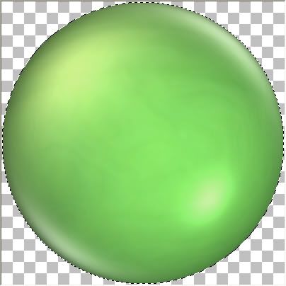
23. Right click on one of the 3 layers and choose Merge then Merge Visable. This is what yours should look like at this point.

Photobucket

24. In the layer palette, right click on your merged layer and choose Duplicate.
25. Go up to the Adjust tab, choose Blur, then choose Gaussian Blur. Set the radius to 5 and click OK.
26. Merge Visable those 2 layers, and then Deselect. (Selections tab, Select None)
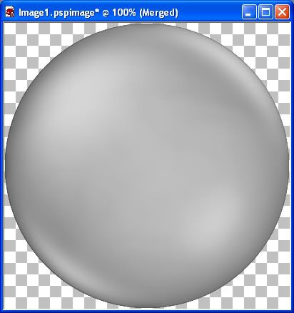
27. Go up to the Image tab, then down to Greyscale and hit OK.
28. Go back up to the Image tab, choose Increase Colour Depth, then choose 16 Million Colours.

This is what yours should look like now:

Photobucket


* This is where we need to save this as a template for you to use whenever you want a coloured brad. But first, hold down your Shift key and hit the D key to duplicate the image for us to use now. Now save your original as a .pspimage somewhere on your computer.

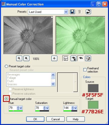
* Now we are going to colour it using the Manual Colour Correction Option. I like this way of recolouring because you can get the EXACT colour that you want. The way this option works is, you have a Source colour (which is the colour your brad is now) and a Target colour (which is the colour we want it to change too).

* I'm using PSP8, but in later versions of PSP, the manual colour correction option may be hidden. Go to this site Khiba's, and scroll down to where it says Custominze! Retrieve Unused PSP 9 Tools and watch her little viewlet. It will show you how to unhide the maual colour correction option.

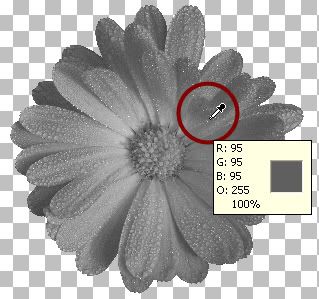
* As you can see, our brad has been greyscaled, and has darker and lighter shades of grey blended together. I've found it's best to choose a medium shade of the grey for our Source colour.

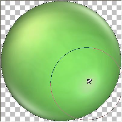
29. Activate the eyedropper/colour picker tool on the left. Click somewhere in the area indicated by the red arrow in the picture below.

Photobucket

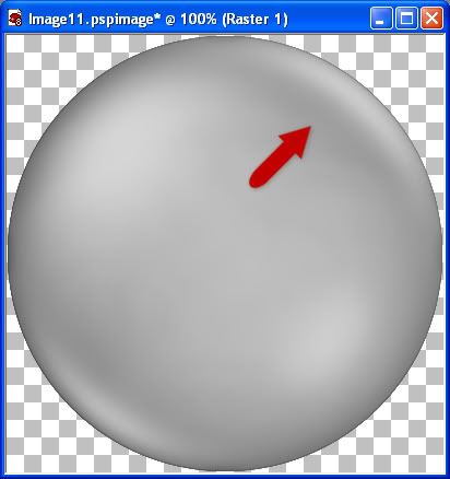
That colour should now be your foreground material colour. Click once in the foreground colour to find the number value of it. Mine turned out too be #A5A5A5.

* Write this number down or copy and paste it to your clipboard.

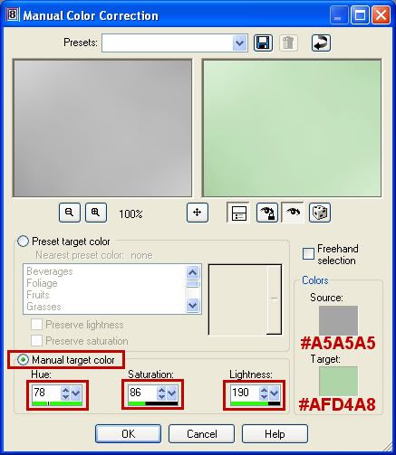
* Now you need to choose a colour you want to turn your brad into. Pick a colour from a kit or just a random colour from the colour palette. I'm going to use a pale green #AFD4A8. Now we have our 2 colours needed for the next step.

30. Go up to the Adjust tab, go over to Colour Correction, then down to Manual Colour Correction. Put all your settings the same as the picture below. Hit the "Eye" icon under the preview picture to see what your brad will look like on your canvas. If you don't like it or want a new shade, change the Target colour to a lighter or darker shade, then hit the OK button when you are satisfied.

Photobucket


That's it :) We started with a gold ball, learned how to smoothed it out, and recolour it to match anything your project needs. Continute on to the next part if you want to learn how to make the outter edge.


Creating the Outter Edge of a Brad

This part of the tutorial uses EyeCandy 5 Impact and one of my presets for it. I've included it in the zip file at the top of this tutorial.


Our newly created brad has filled the 400 x 400 layer, so we need to make room on our canvas for the outter edge, by increasing the canvas size all around our brad.

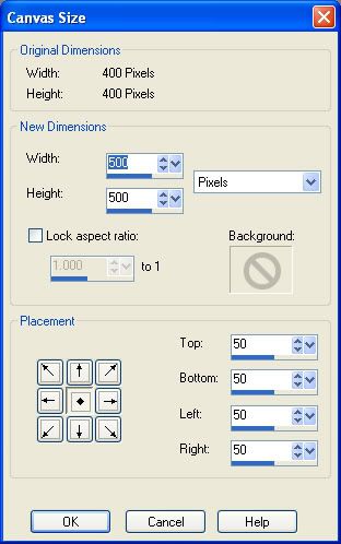
1. Go up to the Image tab, then down to Canvas Size. In the New Dimensions section, change both the width and height to what our canvas size is now, which is 400, and set it to pixels as well. I think increasing the canvas to 500 x 500 will give us enough room to use.
2. In the New Dimensions section, change the width and height to 500 pixels each and click on the OK button. Here's my settings. Make sure yours are the same. If the number 50 doesn't appear in the Placement section for the top, bottom, left and right, in the little boxes to the left, click on the middle box that has a diamond icon on it.

Photobucket

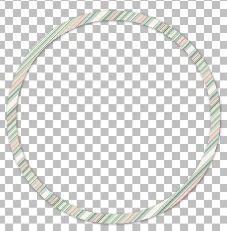
* Next, you need to decide what you want to use for the pattern on the outter edge of your brad. You can choose a paper pattern from one of your kits, or a texture pattern of any kind. You may need to crop it into a smaller 400 x 400 square to use as your pattern.
3. In the Materials Box, click the Pattern tab and set your chosen swatch as your pattern.
4. Go up to the Selections tab, choose Select All, then up to the Selections tab again, choose Float, then back up to the Selections tab and choose Defloat.
5. Go up to the Selections tab, choose Modify, then choose Expand.

* Depending on how wide of the outter edge you want on your brad, set the Number of Pixels accordingly. For this tutorial, we are going to use 15.

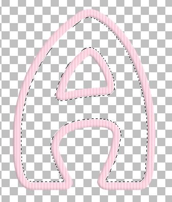
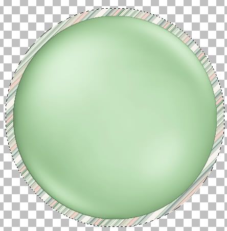
6. Set the number of Pixels to 15 and hit the OK button. There should now be marching ants all around your brad like in the picture below.

Photobucket

7. Go up to the Layers tab, and choose New Raster Layer.
8. Click on the Flood Fill tool on the left, and fill the New Layer with your pattern.
9. In the layer palette, move the pattern layer down below your brad layer. It should look like this now:

Photobucket

10. Make sure your Pattern layer is the active one (highlighted blue in the layer palette) and go up to the Selections tab and then down to Modify and this time choose Contract.

* By expanding the first time 15 pixels away from our brad, (giving us the width of our outter edge), this time we want to contract them by 19 pixels (to give us our inner edge). That's 4 more pixels than when we expanded. The reason for this is, if we only contracted by the same amount we expanded, there would be a space showing between the brad and the under section of our outter edge. If that's confusing, you'll understand better once we DELETE the unneccessary part of our patterned circle away, leaving only our complete outter edge.

Once you've contracted by 19 pixels, this is what you should have.

Photobucket


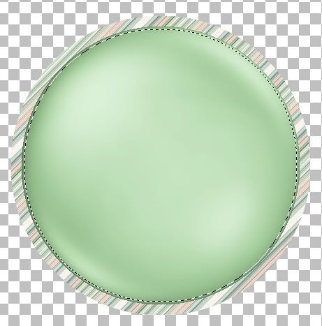
* The marching ants should be showing the extra 4 pixels into our brad layer.

11. With the Pattern layer still the active one, hit your Delete key on your keyboard. (You won't see a change in anything yet)
12. Go up to the Selections tab and choose Select None.

* Click the Eye icon on the brad layer in the layer palette to turn it off so you can see what we just did. By expanding and then contracting our pattern layer, then deleted the unwanted middle of the pattern, we've created the template for our outter layer.

Photobucket


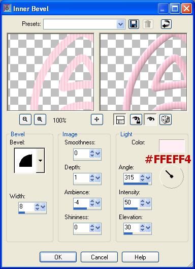
13. With the Pattern layer active go up to the Effects tab, down to Plugins, then to EyeCandy 5 Impact, and choose Bevel.
14. If it isn't already, click on the Settings tab, then in the Users Section, look for SK Smooth Brad and click it one to select it, then hit the OK button.

* Now you can see that we have some jagged edges around our brad, so all you do is, in the layer palette on the right, move the patterned circle layer on top of our brad layer and they disappear. This is the reason in step #10 we contracted by 19, making the circle outter edge 4 pixels bigger than our brad so that it could cover up any uneven edges on our brad.

All that's left to do is to merge visable the 2 layers and that's it :)

Instead of using a pattern and EyeCandy 5 Impact for our outter edge, you can also just flood fill with white and use SuperBlade Pro, which has tons of downloadable presets to choose from, there's many many filters you can experiment with to achieve different looks.

TOU:

If you do this tutorial, your end result is yours to do whatever you wish; give it away as a freebie, use it as part of a kit, or sell it for profit. You may not make this into an action or script to give away as a freebie or to sell for a profit. A mention or a link back here would be appreciated but is not mandatory. Please do not share the supplies or tut through email or any other means, send them here to my blog to get the supplies and tut for themselves.
 
posted by Scrap Stuff by Shawna at 6:58 PM | Permalink | 25 comments
Fill an Alpha
This tut is for paint shop pro users, but can also be done in photoshop with a few minor adjustments.

Photobucket


This tutorial will show you how to fill an alpha with whatever you want to fill it with, but I'm going to use flowers from my pastel spring kit. I did a lower case alpha for that kit, and if you wanted some upper case letters, this will show you how to do it.

Supplies Needed: Greyscaled flower, font, my EyeCandy 5 Impact glass setting (this is optional. put this into your EC5 Impact glass folder) All of which are in the zip file Here.

1. First we need to make our striped pattern for the outline. Open up two 400 x 400 transparent images. Choose a colour and set it as your foreground. In my lower case spring alpha, I used 5 pastel colours. If you are making capitol letters for that, here are the colour values I used:

Pink: #FDC3D6
Green: #B8D8B8
Blue: #7CB5E0
Purple: #B0A2EA
Yellow: #F9E390

2. Flood fill one of the layers with your chosen colour.
3. Next, go up to the Effects tab, choose Texture Effects, then choose Blinds and use these settings:

Photobucket

This is what you should have ended up with.

Photobucket

4. Set your new pink blinds layer as your pattern in the foreground materials box. Angle is 0, and Scale is set to 100. Turn off your background layer. (click the circle with the line going through it to turn it off)

* You can minimize that blinds layer, we don't need to see it onscreen for anything.

5. Double click on the font from the zip and minimize that as well. You don't need to install it because PSP will recognize it from just being open.
6. Click on your text tool and find your font in the dropdown list and use these settings:

Create as: vector
Size is: 300
Stroke Width is: 15
Anti-alias is checked

7. Click once near the bottom left hand corner to position your text starting point and type out the letter you want. We are going to be using A. Click the apply button if it is positioned properly without any part of the letter going off canvas.

* If you don't like the thickness and want to change it to something wider or thinner, go up to the Objects tab at the top, choose Convert Text To Curves, then choose As Single Shape. In the layer palette to the right, click the little + sign beside Vector 1, then double click the layer with the letter A. The vector property box will pop up and you can increase or decrease the stroke width. Also, make sure Visable and Anti-alias are both checked. See picture below.

Photobucket

8. When you are satisfied with what it looks like, in the layer palette, right click on Vector 1 and from the flyout choose Convert to Raster Layer.

* Now we need to give this a bevel. I wanted a squareish one and for whatever reason, PSP seems to give a slight puffiness to bevels and I haven't yet figured out what settings will give me just a slight squared off bevel, so I used Photoshop for it instead. The closest I could come to the same thing in PSP were these settings. If using Photoshop for this, go to the bevel and emboss section, use the defaults except change the depth to 1.

Photobucket

Take a look at the picture below and you'll see what I mean about the slight puffiness to PSP's bevels.

Photobucket

* Now that we have our outline ready, we need to recolour our flowers. We are going to be using Manual Colour Correction for this. If you did my tutorial for Smooth Brads, (it's right above this tut) you will already be familiar with how this recolouring technique works. But don't worry if you don't know how to do it this way, it's not that hard.

9. Open up Flower for Alpha.png. It's a greyscaled image so we can recolour it as many times as we want, to whatever colour we want.
10. Duplicate this image twice by holding down the Shift key and hit the d key on your keyboard and close out the original. Minimize one of the flowers for later use.

* I'm using PSP8, but in later versions of PSP, the manual colour correction option may be hidden. Go to this site Khiba's, and scroll down to where it says Custominze! Retrieve Unused PSP 9 Tools and watch her little viewlet. It will show you how to unhide the maual colour correction option.

* Take a look at the picture below of the Manual Colour Correction box. On the right you will see Source and Target. Source is the colour that we want to change and Target is the colour that we want to change it to.

Photobucket

11. Now we need to pick a shade of grey from our flower to set as the source colour to change. Click on the eyedropper/colour picker tool on the left. Pick a medium shade of grey and when you find one, click once with your eyedropper tool to set it as your foreground colour. My shade of grey is #5F5F5F.

* If you chose a different shade, write it down because we need it for the next step.

Photobucket

12. Go up to the Adjust tab at the top, then over to Colour Balance, then down to Manual Colour Correction. Take a look at the picture just below step #10 and change your settings to the same and click OK. If you used a shade of grey other than #5F5F5F, set that as your Source colour.

* You should have a nice green flower like in the picture below.

Photobucket

* Now we need to change the middle of the flower to something more colourful. The way we are going to do this is to repeat the recolouring process on the second greyscaled flower that you have, so go ahead and unminimize it.

13. Choose a colour for your middle. I'm going to use a nice bright yellow #EFED54. Repeat steps #11 and 12 to change it from grey to yellow. With your eyedropper tool, click on a medium shade of grey in the middle of the flower, I chose #929292, set that as your Source colour, and change your Target colour to #EFED54.
14. You should now have 2 flowers, one yellow and one green. Click on your green flower to make it active and copy and paste it onto your yellow flower layer.
15. Click on your Eraser tool and use these settings:

Default round brush
Size is 10
Hardness is 50
Step is 25
Density is 100
Thickness is 100
Opacity is 63

* Just start erasing the middle very carefully with short clicks of your mouse untill you have the middle erased and the yellow is revealed. When satisfied, merge visable the two layers.

Photobucket


16. Tube your image. Go up to the File tab, down to Export then over to Picture Tube. Give it a name and click OK.


* Do this for as many flowers as you want to use for your project. If you are making the capitols for the alpha, the colours that I used to change the flowers to are listed under step #1 at the top. Let's continue on to how to fill the alpha.

17. After you have completed all of your flowers and tubed them, go back to your letter A image we did at the beginning of this tut.
18. Click on your Magic Wand tool. Mode is Replace, Match Mode is RGB Value, Tolerance is 17, Feather is 0, and Anti-alias is checked.
19. Click once on a blank space in the middle of your A. Marching ants will appear all around the inside border.

Photobucket

20. Next go up to the Selections tab at the top, then to Modify, then to Expand and set the number of pixels to expand at 5 and click OK.
21. Go up to the Selections tab, click on Load/Save Selection and click on Save Selection to Alpha Channel, then click the Save button.

Photobucket

* We are going to have several layers of flowers, and each layer needs to have drop shadows, so doing it this way with the alpha channel will save us from having to keep changing over to the magic wand tool then back again. You'll see what I mean in the coming steps.
22. Next, go to the Layers tab, and choose New Raster Layer.
23. Click on your Picture Tube icon on the left and select your first flower.

* I used a size of 20 and under to fill my alpha. I started with 20 and then just varied the size as I went along.

24. Set your size to 20 and make 3 or 4 clicks with your tube randomly. Make sure you are on your blank raster layer and that it is above your letter A layer. Don't forget that you need to put flowers so that there will be no blank spaces showing between our outline and the flower layer. Don't be afraid to get too close to the edge of the outline, you can always erase with ease since we are on a seperate layer and it will not affect your outline.
25. Using the same flower, set your size to 16 and plop a few more flowers around randomly.
26. Change the size again to 11 and do a few more.
27. Next we are going to put a slight drop shadow on our flowers, but first we need to take the marching ants selection off or the shadow will go around the marching ants themselves instead of on our flowers. Go up to the Selection tab at the top and choose Select None.
28. Now, go up to the Effects tab, then to 3D Effects, then to Drop Shadow. Use these settings:

Photobucket

This is what you should now have:

Photobucket

29. Choose a new colour of flower and repeat steps #21 to #28. Use these quick rundown of the steps below.

* selections tab, load/save selection LOAD selection from alpha channel, click load
* layer tab, new raster layer
* flower size is 20, plop some down 3 or 4, decrease the size and fill in spaces
* selections tab, select none
* effects tab, 3d effects, drop shadow and use same settings

*Repeat with new coloured flowers untill there are no spaces showing beneath like in the picture below.

Photobucket

30. In the layer palette to the right, turn off the bottom layer that has your A on it. (click the eye icon beside that layer to turn it off.)
31. Right click on one of the remaining layer and from the flyout choose Merge, then Merge Visable.
32. In the layer palette, move your newly merged flower layer behind your letter A layer. Your outlined A should now be on top of your flower layer.
33. Next we are going to put a slight drop shadow on the A layer. So make sure the A layer is highlighted in the palette on the right. Go up to the Effects tab, then to 3D Effects, then to Drop Shadow and use the same setting for the shadow as we did in step #28, but this time put a check mark in the box at the bottom that says Shadow on a New Layer.

*All we want is the shadow that is in the inside of the A, not the one showing up on the outside.

34. We need to erase the outter shadow, so click on the eraser tool. We are using the same settings as we used when we erased the green middle of the flower to let the yellow show through, so your tool should still be at those same settings. Make sure your active layer is the shadow layer, and go ahead and erase all around the outter edge of the A. Yours should end up looking like this when done.

Photobucket

Just right click on one of the layers and merge visable and you are done. If you want to make a glass looking cover for it, don't merge your layers yet.

Make the merged flower layer active, open up EyeCandy 5 Imapct, go to glass, find my glass preset called SK Perfect Glass Setting, select it and press ok when done.

TOU:

If you do this tutorial, your end result is yours to do whatever you wish; give it away as a freebie, use it as part of a kit, or sell it for profit. You may not make this into an action or script to give away as a freebie or to sell for a profit. A mention or a link back here would be appreciated but is not mandatory. Please do not share the supplies or tut through email or any other means, send them here to my blog to get the supplies and tut for themselves.
 
posted by Scrap Stuff by Shawna at 6:39 PM | Permalink | 26 comments