Tuesday, August 5, 2008
Gingham
Photobucket

Supplies: Texturizer plugin and my texture swatches. This is optional and only if you want to give your pattern a little bit of texture. You don't need it to make this gingham tutorial. In the example above, I've used a quilted texture, which I've included in the zip, along with another different texture that you will see in the example photo's in this tutorial.

Download these from Download Supplies Here.

Place the texturizer plugin wherever you have your plugin folder on your computer. Also, I use this plugin A LOT, so i've made a folder called texturizer swatches and put it into where i have all of my PSP stuff in My Documents. It just makes it easier to find all my textures if they are in one place.


** When doing this tutorial for the first time, use the same colours and sizes that I do so that there is no confusion in the tut. You can change the colour and size if you want when doing it another time.


1. Start by opening up a 20 by 20 transparent image.

* This will be your main canvas. It's small because gingham is made of tiny check patterns.

2. Set your foreground to white (i'm actually not using white as i think a slightly off white looks better #EFEFEF). Now flood fill your 20 x 20 with this colour.

3. Tiny canvases are hard to work with while they are so small, so lets enlarge it by clicking on your zoom tool on the left and type in 3000 in the percentage box. ( the zoom tool is the icon on the left that looks like a white arrow pointing upward and to the left).

4. Open up a 10 by 10 new transparent image.

5. Flood fill this with your main colour you want your gingham to be. In this case mine is #F8C2C2.

6. Go up to the Edit tab and down to Cut, then click on your main 20 x 20 white canvas to activate it.

7. Go up to the Edit tab again and choose Paste, then Paste as New Layer.

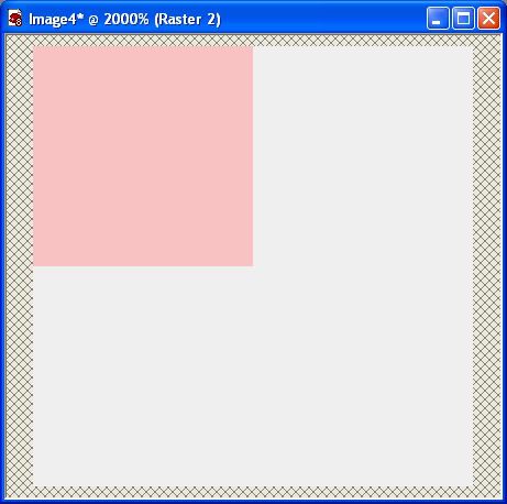
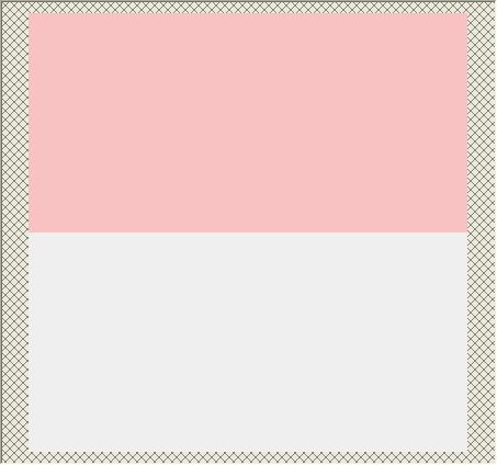
* Your pink square should now be in the middle of your canvas.

8. Click on your Mover tool and move the pink square up and over to the top left of your canvas. If you move it slowly, you will notice that your pink square will snap into place when you reach the top left of your canvas. This is what you should have now:

Photobucket

9. In your layer palette on the right, right click on Raster 2 ( which should be your pink square) and choose Duplicate.

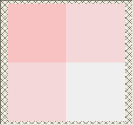
10. Now go up to the Image tab and choose Mirror. Your duplicated pink square should have flipped over to the right hand side of your canvas like this:

Photobucket

* Now we need this one to be a lighter shade of pink than our first one so...

11. In the layer palette, lower the opacity of your duplicated square to about 52%.

* We need to make a copy of this lighter pink layer and position it in the bottom left hand corner.

12. In the layer palette, right click on your light pink layer and choose Duplicate.

13. Go up to the Image tab and choose Flip then back up to the Image tab and choose Mirror.

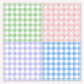
Taa Daa, you've got yourself a seamless gingham pattern.

Photobucket

14. Right click on one of the layers and choose Merge then Merge Visable. Save this somewhere on your computer, but don't click it off. We aren't finished yet.

* You can test it out by setting it as your foreground pattern and flood filling a new 200 x 200 canvas.

If you'd like to give it a little bit of a texture, I'm going to show you a couple different ones next if you continue on.

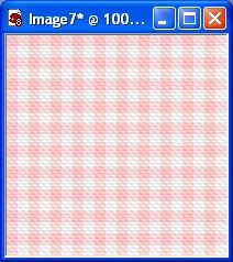
15. OK, you've flood filled a 200 x 200 canvas with your new gingham pattern and you should have this:

Photobucket

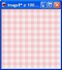
* This 200 x 200 canvas is just a test image we are doing. If you were making an actual page, you would make your canvas whatever size you needed and then did the textures on there.

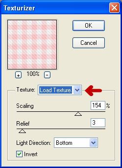
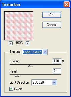
16. Go up to the Effects tab, down to Plugins, then over to Texture and click on Texturizer. In the dropdown box indicated with the red arrow, click on that and click on Load Texture. Navigate to wherever you saved SK Gingham Texture.psd from the zip, click on it once then click Open and it will load as your chosen texture. Then change the rest of your settings to the one in the picture below and click OK.

Photobucket

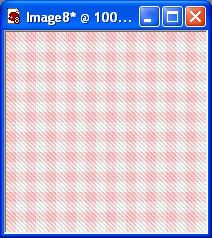
This is what you should have.

Photobucket

Photobucket

This setting gives you a faint grosgrain look:

Photobucket

Experiment with the settings and different textures and see what you can come up with.

TOU:

If you do this tutorial, your end result is yours to do whatever you wish; give it away as a freebie, use it as part of a kit, or sell it for profit. You may not make this into an action or script to give away as a freebie or to sell for a profit. A mention or a link back here would be appreciated but is not mandatory. Please do not share the supplies or tut through email or any other means. If you are using this or any of my tutorials for your groups or as part of your own tutorial, please post a link to the tut on my blog and let your members download the supplies from my blog for themselves.
 
posted by Scrap Stuff by Shawna at 7:06 PM | Permalink | 23 comments
Putting Together Your Kit Preview For Your Blog
This is one tutorial that I never really thought about people not knowing how to do, so thanks for the request Sharon. I'm sure it's going to be of help to some people. I don't know how others do theirs, but this is how I do mine, and it works for me.

First thing you need to do before anything else is find out what size of canvas width your blog or site will allow, without it overlapping into the sides of your blog. My width limit is 550 pixels, but my length can be anything I choose. I'm going to be using my Spring Kit for this tut.


Normally, I use all my papers as my background for the preview, so open up all of your papers in PSP and duplicate each one (hold down your Shift key on your keyboard and hit the D key to duplicate) then close out the originals. We are going to be cutting these so we don't want to wreck the one's you are going to be giving away.

1. Select one of your duplicated background papers to start working with. Click on your Crop tool on the left.

2. Up at the top, you will see Width and Height. Photobucket. Type in the amount of pixels that your preview canvas is. Mine was 550 x 550.

3. Place your cursor on your paper somewhere inside your crop box and then move the crop box to a section of your paper that you want displayed as part of your preview background. When you've got that set as you like it, just double click inside the crop box. This will be your main canvas you will be working on.

This is the cropped version of my first background paper that I chose:

Photobucket

4. Choose another background paper and crop it to the same Width and Height as you did with the first paper.

* Now we are going to either drag and drop or copy and paste this second paper onto your first paper that is on your main canvas.

5. Make sure your second paper is the active one, and go up to the Edit tab, then to Copy. Click on your main canvas ( which is what your first cropped paper is on) to make it the active one. Then go back up to the Edit tab and over to Paste, then to Paste as New Layer.

* Your second paper will be covering your first, so we need to move that down.

6. Click on your Mover tool on the left and shift your second paper down a little bit so that you can see both of them. Here's what mine looks like at this point:

Photobucket

* All drop shadows will be left untill the end so don't put any on just yet.

* I actually have 10 papers in this preview, but becase it's very early in the morning and I'm lazy, I'm only going to be doing 3.

7. Repeat theses steps for as many papers as you have in your kit. Use your mover tool to shift each one downwards and make them evenly spaced with each other. Here's mine with 3 papers:

Photobucket

* Now that we've got our papers displayed as we want them, it's time for the elements. I always tube my elements when doing preveiws. I do this because it is much easier to resize them down this way than just duplicating them, then resizing. Also, I find that they come out nicer without the distortion and sometimes jagged looking edges.

8. Start by opening up some of the elements you want to use in the preview. If you have a ton of them in your kit, you may not be able to display them all, so open up the ones you like the best. I'm going to use a few of the paperclips I had made for this kit.

9. I always name my preview tubes starting with the word Temporary so that I can find them easily when I am done my preview and delete them so it doesn't clog up my tube section. So for example, I have my first paperclip ready to tube. Duplicate it and close out the original. Crop out all the unneccissary space around your first element, and make sure it doesn't have more than 1 layer.

10. Go up to the File tab, down to Export, then over to Picture Tube. Give your tube a name such as temporary spring 01 ( or whatever your kit is called) and then click the OK button.

11. Do this for each of the elements you are going to be using for your preview. It doesn't matter if it is a really big element either, such as a frame, it can still be tubed.

12. When you've finished your tubing, on your background main canvas, create a new layer. (Layers tab at the top, choose New Raster Layer).

13. The placement of your elements is all up to you, but you need to get the sizing of them appropriately for your preview. What I do is, make a duplicate of your main background canvas to use as a test run. Click on your Tube tool and choose your first element.

14. Plop it down on your test run canvas to see how big it is. More than likely it will be too big for your preview, but it gives you an idea of how much you need to scale it down. Go up to the Edit tab and click undo to get rid of it, then scale it down a bit and plop it back onto your test run canvas. ( to scale down, look up top for the section labled Scale and under it will be 100. Use the down arrow next to it to scale it down to a lower number. This will decrease your tube's size) Do this untill you find a size that looks good. Then go back to your main canvas and put your tube down there. Remember to always put each tube on a new layer so that you are able to move it around and to apply your drop shadow to a single item.

* Tip: Don't make everything the same size, vary it up. Here's mine. I've added a few elements and have not yet put a drop shadow on anything.

Photobucket

15. When you have it all placed and it looks good, then you can click on each item seperately and put on a drop shadow of your choice. I can't tell you what that is because your shadow will depend on your own elements. If it is a light colour, you will not be using the same very dark shade of a shadow that you would on a dark coloured element. So that part is all up to you.

* When your shadows are finished, you need to put your blog address and title on your preview kit. This is up to your own imagination and likes and preferences. Most times, I just use a simple partially opaque ribbon going across the preview pic, and I add my blog address and the name of my kit.

16. I've set my forground to a gold pattern, turned off my background so that I will just be getting an outline of a rectangle and not a filled one. Line style is solid, and a width of 1. Draw out your rectangle straight across your preview canvas. Right click and convert to raster layer.

17. Click on your Magic Wand tool, and click once inside your rectangle that's on your canvas. You should have marching ants all around inside the rectangle.

18. Go up to the Selections tab, down to Modify then over to Expand. Expand by 1 pixel.

19. Go up to the Layers palette and make a new raster layer and drag it under your rectangle you just drew.

20. Click on your Flood Fill tool on the left and fill your blank layer with white, then lower the opacity to about 45.

* The lowered opacity of the white lets you have the appearance of a label ribbon, but still lets you see what is beneath it.

21. Go up to the Selections tab at the top and choose Select None. Here's where I'm at right now.

Photobucket

22. In the layers palette, turn off all of your layers except the outline of the gold rectangle and the lowered opacity white layer. Then right click on one of those still visable layers and choose Merge, then Merge Visable.

* You can now move this down to the middle of your preview canvas.

* You need to put a slight drop shadow on your ribbon label and with white opaque items, that's a bit tricky. This is my way of doing it.

23. Make your label ribbon acitve by clicking on it on your canvas or in the layer palette. Go up to the Effects tab, then to 3D Effects, then over to Drop Shadow. Use these settings:

Vertical: 1
Horozontal: 1
Opacity: 32
Blur: 7
Colour: #221D12
Shadow on a New Layer is CHECKED. << Very important that it is on it's own layer.

* You'll notice that your white had turned darker because of the shadow we just put on it. We are going to get rid of most of it with our rectangle tool.

24. Click on your Selection tool and set it to rectangle. We want to get our rectangle as close to the top and bottom gold outlines as possible. Try not to go outside of the gold oulines because then you will be deleting part of your shadow. You may want to zoom in closer for this step. See my example below:

Photobucket

25. Once you are satisfied with your results, make sure you have the shadow layer of your label ribbon as your active layer in the layer palette. Hit the delete key on your keyboard. By doing so, you have just deleted all the shadow from inside your white label but still have the shadow showing only on the outsides of your label.

26. Choose a nice font and colour for your text. Normally, I choose a darker shade for the foreground and a lighter shade of the same colour for the background. In this case, I'm going to use #2E9ED2 for my foreground outline, and #A6D9F0 for my background fill of my text.

27. Type out the name of your kit, your blog name/address and any other information you want on there.

28. All that's left to do is to save it as a .jpg and you're ready to upload it to photobucket or some other photo hosting site.

Photobucket
 
posted by Scrap Stuff by Shawna at 6:36 PM | Permalink | 12 comments